If you're pulling numbers from Instagram, LinkedIn, X, Facebook, and Threads into one client deck every week, the main problem usually isn't the dashboard. It's the workflow upstream. PostOnce solves that upstream mess by giving you a single publishing hub for crossposting, which makes unified performance reporting much easier to build and maintain. When one tool controls what went out, where it went, and when it published, the reporting layer gets cleaner fast.
Most social reports break down because the data is fragmented before analysis even starts. You end up reconciling post names, dates, formats, and platform quirks by hand. That wastes time, but the greater issue is that it makes it harder to connect social activity to business goals.
Your Guide to Smarter Social Media Reporting
A social media report that clients read does three things well. It shows what changed, it explains why it changed, and it points to the next action. Everything else is decoration.
That sounds obvious, but most reporting habits push teams in the opposite direction. They export too many platform metrics, drop them into a spreadsheet, and call it done. The result is usually a dense file full of impressions, reactions, and follower counts with no clear throughline. The client sees activity, not direction.
Start with one reporting view
If you're managing crossposted content, the first fix is simple. Stop treating each platform as a separate reporting world.
You need a unified reporting view that tracks the same content idea across channels. That means using a consistent naming convention for campaigns, a shared reporting period, and one place where publishing activity is logged before performance data gets layered on top. Without that foundation, you're comparing apples to screenshots.
A useful report answers questions like these:
- What content themes performed best: Not just which single post got the most engagement.
- Which platforms fit which goal: Awareness, conversation, traffic, or lead support.
- What changed over time: NetSuite notes that performance metrics are strongest when they show change over time or are compared with an industry benchmark, and it highlights balanced scorecard categories of financial, customer, internal process, and organizational capacity metrics in its overview of performance metrics.
- What the team should do next: More of a format, less of a topic, a different posting cadence, stronger creative hooks.
Practical rule: If a metric doesn't help you make a content, budget, or channel decision, it probably doesn't belong on page one.
There's also a presentation issue. Clients don't want to reverse-engineer your logic from raw exports. They want the short version first. If you're working on achieving marketing reporting clarity, the same principle applies in social. The clearer the structure, the more likely the report gets used.
Reporting should reduce work, not create it
The best performance reporting setup saves your analysis time for interpretation. It doesn't trap you in copy-paste cycles every Monday morning.
That means building around repeatable inputs. One campaign name. One reporting cadence. One KPI set. One summary format. Once those are stable, dashboards become useful because they stop changing shape every week.
Defining What Matters Your Social Media KPIs
Monday morning gets messy fast when you pull numbers from Instagram, LinkedIn, TikTok, and X, then realize the same post was crossposted everywhere and each platform labels performance a little differently. That is how teams end up with bloated reports, fuzzy conclusions, and clients asking which numbers matter.
The fix is a KPI set built around business purpose first, then translated across platforms in a consistent way. For a unified report, that usually means grouping social metrics into awareness, engagement, and conversion. It is simple enough to repeat every month and flexible enough to handle platform differences without flattening them.
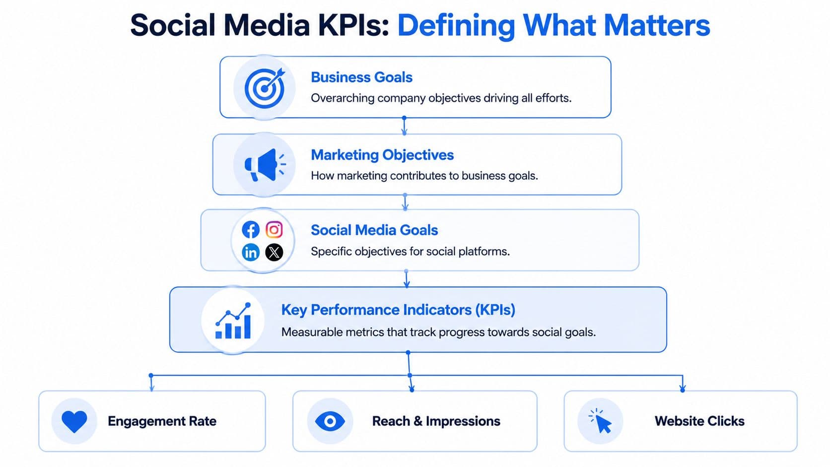
Tie KPIs to the business goal first
Start above the channel level. If the client wants pipeline support, the report should not be led by vanity engagement. If the goal is visibility, raw lead counts will not explain whether content distribution is working.
Use a simple mapping like this:
| Business intent | Social goal | KPI examples |
|---|---|---|
| Brand visibility | Get content in front of the right audience | Reach, impressions |
| Community building | Increase audience interaction | Comments, shares, saves |
| Traffic support | Drive visits to owned channels | Link clicks |
| Lead support | Push users toward capture points | Lead form submissions, qualified click activity |
This step matters even more when content is crossposted. One asset can produce reach on one platform, discussion on another, and site traffic from a third. A unified report needs one goal framework that holds all of that together.
Use fewer KPIs than you want
Keep the top-line KPI set to 3 to 5 core metrics. That forces prioritization and makes month-over-month reporting easier to read.
A practical stack often looks like this:
- Primary awareness metric: Reach or impressions, based on which one the platform reports consistently enough for your workflow.
- Primary engagement metric: One anchor metric such as comments, shares, or saves, chosen based on the client's actual objective.
- Primary traffic metric: Link clicks, if social is expected to support site visits.
- One quality signal: Video watch depth, saves, or another metric that reflects stronger intent for the content type.
- One operational metric: Publishing consistency or content volume, if delivery discipline affects results.
Use the same stack long enough for trends to mean something.
If you need a sharper framework for choosing those metrics, this guide to social media key performance indicators is a useful reference.
Cross-platform reporting needs translation
Unified reporting does not mean every metric is interchangeable. LinkedIn shares, Instagram saves, TikTok watch time, and X link clicks each signal a different kind of response. Treat them as role-based indicators inside one reporting model.
That is the practical way to handle crossposting. The same post can be published everywhere, but each platform may contribute in a different way. LinkedIn may generate qualified clicks. Instagram may show stronger content retention. TikTok may widen reach at the top of the funnel. The report should make those roles visible instead of forcing every channel into one blended engagement number.
This is also where automation helps. Tools built for multi-platform publishing and reporting, such as PostOnce, make it easier to standardize campaign names, track the same content across channels, and pull results into one structure from the start. That setup saves time later because you are comparing aligned inputs instead of cleaning exports by hand.
Building Your Social Media Performance Report Template
A strong report template doesn't just collect metrics. It organizes decisions.
When I build reporting for social teams, I separate the document into layers. The top layer is for a client or director who wants the short answer in under a minute. The next layer is for the marketer who needs context. The final layer is where supporting detail lives.
The four parts every report needs
If your template doesn't have these parts, it usually turns into a data dump.
-
Executive summary
One short paragraph. State what happened, what mattered, and what action follows. Keep it readable without scrolling. -
Core KPI dashboard
Show the handful of metrics you chose earlier. These should appear with trend context, not as isolated totals. -
Highlights and lowlights
Explain which content worked, which didn't, and what patterns are emerging. -
Action plan
End with concrete next steps. Adjust content format, posting mix, creative angle, or channel emphasis.
Separate what happened from why it happened
Many reports improve immediately with this approach. Jaspersoft notes that an effective performance reporting workflow separates descriptive reporting (what happened) from diagnostic reporting (why it happened) and predictive reporting (what is likely next) in its reporting performance guide. That structure matters in social because teams often stop at the descriptive layer.
Here's the practical version:
| Report layer | What belongs there | Common mistake |
|---|---|---|
| Descriptive | Reach, clicks, engagement, posting volume | Listing numbers with no interpretation |
| Diagnostic | Topic fit, format choice, timing, audience response | Guessing without comparing patterns |
| Predictive | Next content tests, platform shifts, workflow changes | Making vague recommendations |
A clean monthly report might say:
Reposts of educational carousel content held attention better than promotional updates, while short opinion-led text posts drove stronger conversation on professional networks. Next month, increase educational repurposing and reduce low-context promo posts.
That's more useful than filling a page with post-level exports.
Build for scan speed
Most clients won't read every row in Google Sheets, and they won't open every tab in Looker Studio. Design for scan speed.
Use this sequence:
- Open with the summary: Put the answer first.
- Keep charts simple: One message per chart.
- Label trends clearly: "Up from prior period" is more useful than a naked number.
- Use post examples sparingly: Include enough to prove the pattern, not every single asset.
- Close with ownership: State who will do what next.
If you need a starting point for the source document underneath the report, this social media audit template is a useful base.
A walkthrough can also help when you're standardizing the format across a team.
What not to include on page one
Junior marketers often overpack the front page because they're trying to prove effort. Resist that.
Leave these out of the top section unless they directly matter:
- Raw exports by platform: Keep them in an appendix or supporting tab.
- Every vanity metric available: Follower movement can matter, but it rarely deserves headline placement.
- Too many charts: Three readable visuals beat nine confusing ones.
- Context-free post lists: A list of links isn't analysis.
Good templates don't impress people with volume. They reduce cognitive load.
PostOnce Your Solution for Unified Reporting
Unified performance reporting breaks when content publishing is fragmented. If one post idea gets adapted manually across several networks, the reporting team has to reconstruct the timeline later. That's where errors creep in.
The exact search intent behind performance reporting in a crossposting workflow is usually this: How do I track one content effort across multiple platforms without rebuilding the report from scratch every week? The answer starts with the publishing system, not the dashboard.
Why a crossposting hub changes reporting
When one tool serves as the distribution layer, you gain a reliable record of what was posted, where it was posted, and when it went live. That becomes the backbone of a unified report.
Instead of pulling platform analytics first and trying to match posts after the fact, you start with the publishing log and enrich it with results. That changes the reporting job from reconciliation to analysis.
This approach helps teams answer questions like:
- Did the same creative behave differently by channel
- Which platform rewarded the format best
- Whether timing or audience context changed the outcome
- Which recurring content themes deserve more distribution
DataCore's documentation on historical monitoring is helpful here because it describes historical performance systems as tools built to record the current state long-term and preserve data for later analysis in its overview of historical performance monitoring. The same logic applies to social. If your publishing system preserves a clean history, trend analysis gets much easier.
What this looks like in practice
Say a team publishes one product education post across LinkedIn, X, and Facebook. With a centralized publishing workflow, the report can group those platform entries under one campaign or post family.
Now you can review the output in a smarter way:
| Reporting question | Fragmented workflow | Unified workflow |
|---|---|---|
| What published where | Rebuilt manually from platform tabs | Logged from one source |
| Compare the same content idea | Hard to verify matching assets | Easy to group by parent post |
| Analyze over time | Inconsistent naming causes drift | Historical continuity is stronger |
That kind of consistency is why tools built for social operations matter. A dedicated social media post manager doesn't just help publishing. It improves the quality of downstream reporting because the source data starts cleaner.
One clean publishing record often removes half the reporting friction before you touch a chart.
Automating Your Reporting Workflow
Manual reporting fails in the same place every time. The collection step takes too long, so the analysis gets rushed.
A better setup uses automation to move raw platform data into one structured destination, then leaves human time for interpretation and QA. The workflow doesn't need to be complex. It needs to be dependable.
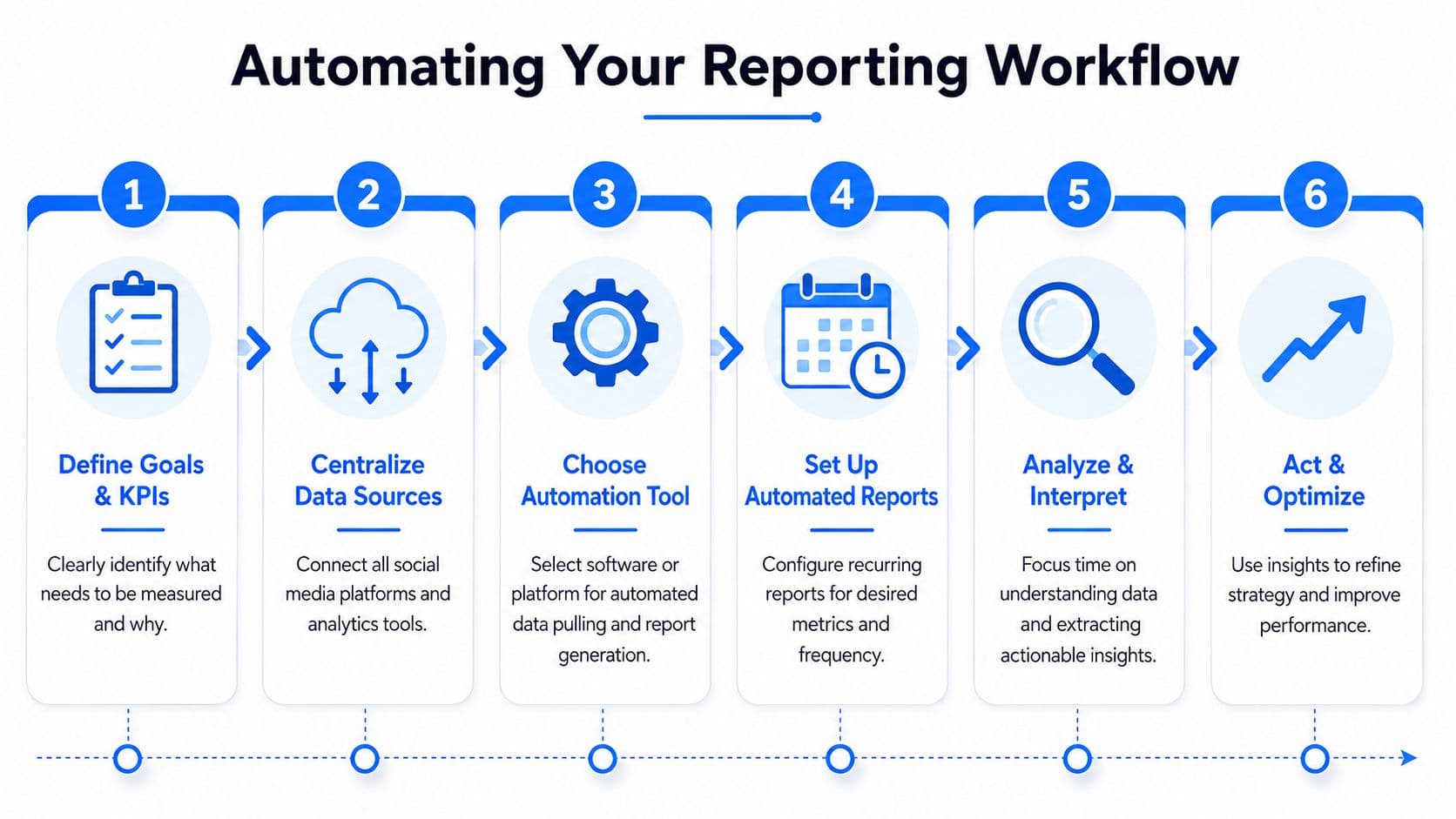
A simple automation stack
For most small teams or agencies, this stack is enough:
- Collection layer: Platform exports, native analytics, or connector tools
- Transport layer: Zapier or Make
- Storage layer: Google Sheets, Airtable, or a database
- Visualization layer: Looker Studio
- Review layer: A manual QA check before reports go out
The handoff matters. Your automation should move data into a consistent schema. If Instagram labels a metric one way and LinkedIn labels a similar metric another way, normalize those fields before the dashboard stage.
Automation helps most at the messy part
The hard part usually isn't charting. It's standardizing inconsistent inputs.
That matches what V7 Labs describes in investment reporting. It says a process that typically takes two weeks to gather and standardize portfolio data can be reduced to one to two days when systems ingest files, extract structured fields, and flag discrepancies for human review in its guide to portfolio performance reporting. The lesson for social teams is straightforward. Automation creates the biggest lift when it handles messy normalization and exception flagging, not just final visualization.
If you're designing the flow itself, PlotStudio AI's automation insights offer a useful perspective on reducing repetitive reporting work without removing human review.
Keep humans in the loop
Automation should remove repetitive tasks, not accountability.
Build these controls into the workflow:
- Field checks: Make sure campaign names, dates, and platform IDs map correctly.
- Exception review: Flag missing values, duplicate rows, or obvious outliers.
- Publishing cadence checks: Confirm the dataset reflects the actual reporting period.
- Final QA: Review the output before it reaches a client.
If you want the underlying process mapped more clearly, this explanation of workflow automation is worth a read.
Automated reporting without QA doesn't save time. It just moves the mistake further downstream.
Interpreting Results and Driving Action
A report earns its keep when somebody changes behavior because of it. If no decision follows, the reporting may be tidy, but it isn't useful.
That means every reporting cycle should end with a recommendation tied to an observed pattern. Not a generic conclusion like "keep testing content." A real move.
Turn observations into decisions
Weak interpretation sounds like this:
- Observation only: Video posts did well on Instagram.
- Still too vague: Educational posts drove more engagement.
- Actionable: Short educational videos generated stronger discussion than static promos, so next month the team should prioritize that format for product education and reduce low-context promotional posts.
The difference is operational clarity. A junior marketer should know what to publish differently after reading the report.
The Volcker Alliance makes an important point in its discussion of better performance reporting. Reporting drives change when it's timely and usable for learning, not when teams produce more of it. That applies directly to social. A monthly deck delivered late and padded with screenshots won't improve strategy. A concise report delivered on time with clear decisions might.
Ask better closing questions
Before you finalize a report, check whether it answers these:
| Question | Why it matters |
|---|---|
| What changed from the prior period | Establishes movement, not just totals |
| What likely caused the change | Connects metrics to content choices |
| What should the team repeat | Preserves winning patterns |
| What should the team stop or adjust | Prevents drift and wasted effort |
That final step is where analysis turns into management. If you need help sharpening that skill, this guide to social media report analysis is a practical next read.
A good social report doesn't just explain the past. It gives the next publishing cycle a clearer brief.
If you want cleaner performance reporting without rebuilding your workflow every week, PostOnce gives you the missing foundation. Publish once, crosspost across platforms, keep your distribution organized, and make unified reporting far easier to maintain.