If you're trying to turn a camera roll full of product shots, event photos, or behind-the-scenes images into one clean Instagram Story, the bottleneck usually isn't design. It's workflow. You make the collage, post it once, then repeat the same manual work across other channels. That's exactly the gap PostOnce cross-posting automation is built to solve.
A good Instagram Story collage should do two jobs at once. It should look sharp on a phone screen, and it should be fast to produce when you're publishing often. Often, the focus is solely on the first part. The stronger approach is to build a repeatable system so one set of assets becomes multiple usable posts. If you also work with Story video, this practical guide to Instagram Stories video length for marketers is worth keeping nearby because Story pacing and layout design affect each other more than is commonly realized.
Before you drag, crop, and stack anything, get the canvas right. Instagram Stories use a vertical format, and if your assets aren't prepared for it, you'll waste time fixing awkward crops later. A quick reference for that is this guide to Instagram Stories dimensions. Once the dimensions are locked in, making a collage on Instagram Story gets much easier, whether you use Instagram's own tools or build something more polished in a design app.
Your Guide to Standout Instagram Story Collages
Most collage tutorials stop at button clicks. They show you where Layout lives, how to tap the sticker icon, and how to resize an image with two fingers. That's useful, but it doesn't help much when you're posting every day and need quality without slowing down the rest of your content calendar.
The better question is this: what kind of collage are you making, and how fast do you need to make it? A casual Story recap needs a different workflow than a branded launch sequence. A restaurant sharing today's specials can move fast with native Instagram tools. An agency building client stories usually needs tighter spacing, brand fonts, and reusable templates.
Three workflows cover almost every situation:
- Native Instagram tools work best when speed matters and you don't want to leave the app.
- Third-party design apps make sense when you need stronger branding, reusable templates, or a cleaner visual system.
- Automation after creation becomes the next efficiency win once you've built the asset and want to reuse it across channels.
The teams that move fastest usually don't design from scratch every time. They reuse a pattern, swap assets, and publish.
That's the practical lens for how to make a collage on Instagram Story without turning a simple Story into a design task that eats half your afternoon. The goal isn't to show off every feature. It's to produce something clear, readable, and on-brand with the least friction possible.
Creating Collages with Instagram's Native Tools
Instagram already gives you two workable ways to build a collage inside Stories. One is structured. The other is loose and more editorial. Instagram's own Help Center confirms both approaches: Layout for grid-based collages and photo stickers for freeform layering on the Story canvas, which is built for a 1080 × 1920 vertical format in Instagram's Help Center.
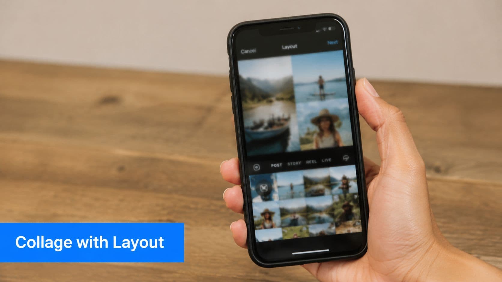
Use Layout when you need speed
If you want the fastest answer to how to make a collage on Instagram Story, start with Layout. It gives you a predefined grid, which means less fiddling and fewer alignment mistakes.
The basic workflow is simple:
- Open Instagram and start a new Story.
- Tap Create, then Story.
- Choose Layout.
- Pick the grid style you want.
- Fill each frame from your camera roll or capture something live.
- Add text, music, or GIFs only after the images are in place.
This method works well for product roundups, event recaps, before-and-after posts, and quick mood boards. The fixed structure keeps everything aligned without extra effort.
Practical rule: If the Story needs to be published in minutes, use Layout. If it needs personality, use stickers.
One more detail matters here. If you regularly publish Stories and want the full posting workflow cleaned up, this walkthrough on how to post a Story on Instagram is useful because a lot of wasted time happens after the collage is already finished.
Use photo stickers when the grid feels too rigid
The second native option is the photo sticker method. This is what I reach for when a grid looks too templated or when one image needs to dominate while supporting images sit around it.
The process is less obvious than Layout:
- Start a Story with a background image, plain background, or color fill.
- Open the sticker tray.
- Add a photo sticker from your camera roll.
- Repeat to layer more images.
- Resize, rotate, and place each sticker manually.
This gives you much more freedom. You can create a scrapbook feel, frame a hero product shot with detail images, or build a collage that looks closer to a custom design than a stock grid.
Common mistakes show up fast with this method:
- Too many images: the Story turns into a wall of thumbnails.
- No anchor image: nothing tells the eye where to look first.
- Messy overlap: stickers hide important content or make text unreadable.
- Late text placement: captions get squeezed into leftover space instead of planned space.
A quick demo helps if you want to watch the flow before trying it yourself.
Which native method works better
If you're choosing between the two, use this rule of thumb:
| Need | Better native option |
|---|---|
| Fast publishing | Layout |
| Clean symmetry | Layout |
| More personality | Photo stickers |
| Layered storytelling | Photo stickers |
| Less repositioning | Layout |
| More creative freedom | Photo stickers |
Native tools are good enough for a lot of Story content. They're just not always the best option when brand consistency matters more than speed.
Using Third-Party Apps for Advanced Collages
Instagram's native tools are quick, but they hit a ceiling fast. You notice it when the collage needs branded typography, consistent spacing, reusable templates, or a design that doesn't look like it was assembled inside a social app.
That's when external apps become the better choice. Canva is usually the practical default for teams because it's template-heavy and easy to hand off. Unfold is useful when you want a cleaner, editorial style. Some creators also prefer apps with more spatial freedom, and if you're comparing broader visual planning workflows, this breakdown of key features of infinite canvas apps gives a useful lens for thinking about layout flexibility.
When Canva beats Instagram
Canva wins when the collage is part of a repeatable content system. You can build one Story format for testimonials, another for product features, and another for weekly recaps. Then you just replace images and text.
That beats rebuilding everything in Instagram every time.
A basic Canva workflow looks like this:
- Choose the right Story format: Start with an Instagram Story template so you're designing for the right shape from the beginning.
- Pick a layout with room to breathe: Don't choose the busiest template just because it looks fancy in the preview.
- Drop in your strongest image first: This helps you establish hierarchy before adding supporting visuals.
- Lock in brand elements: Add your colors, logo treatment, and preferred font styles.
- Export to your camera roll: Once the collage is finished, save it and upload it into Instagram Stories.
If your photos need cleanup before they even hit the design stage, an Instagram image resizer can save you from stretching, awkward crops, and low-quality exports.
Canva versus Unfold
These tools overlap, but they don't feel the same in practice.
| Tool | Best for | Trade-off |
|---|---|---|
| Canva | Templates, brand systems, quick team reuse | Can feel generic if you don't customize |
| Unfold | Minimalist Story designs, elegant presentation | Fewer broad customization options |
| Native Instagram | Fast, in-app publishing | Limited branding control |
The main trade-off is speed versus polish. Native Instagram is faster at the moment of posting. Canva is faster over time if you reuse templates. Unfold sits in between and often produces a more refined look with less visual noise.
What external apps do better
Third-party apps are worth the extra step when you need:
- Brand consistency: logos, fonts, and colors stay stable across campaigns.
- Template reuse: one approved layout can support multiple posts.
- Cleaner text handling: captions and labels look intentional, not squeezed in.
- Stronger composition control: spacing, alignment, and cropping are easier to fine-tune.
If the collage is tied to a launch, sale, client report, or recurring content series, external apps usually pay for themselves in saved editing time and fewer last-minute fixes.
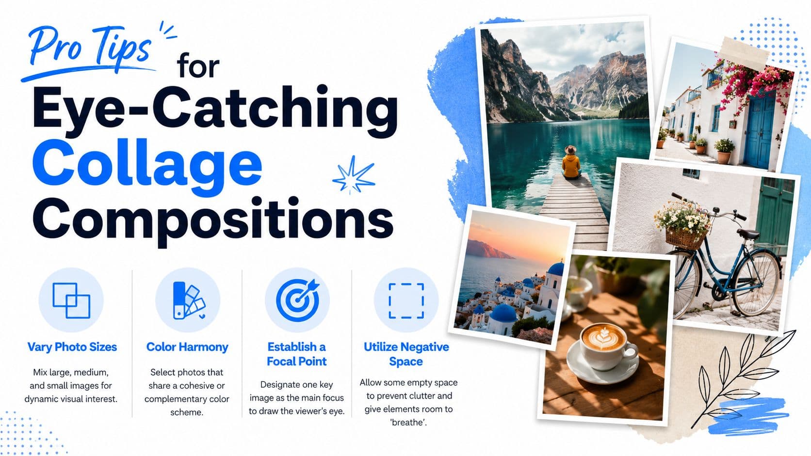
Pro Tips for Eye-Catching Collage Compositions
Most bad Story collages don't fail because of the app. They fail because the composition asks the viewer to process too much at once. On a small screen, clutter kills clarity.
One useful guideline from Minter's Instagram collage guide is to use 2 to 4 images for better readability on Instagram's 1080 × 1920 vertical canvas, instead of cramming the Story with 9 tiny thumbnails. That same guidance lines up with a broader accessibility point: clear visual hierarchy and ample spacing matter, especially for viewers who need visual clarity.
Do this, not that
Use these rules when a collage feels off but you can't tell why.
- Lead with one dominant image: Don't give every photo equal weight. Pick a hero image and let the others support it.
- Leave empty space on purpose: Don't treat every blank area as wasted space. Negative space improves comprehension.
- Group similar tones: Don't mix images that clash so hard they feel unrelated unless that contrast is intentional.
- Add short text, not paragraphs: A Story collage isn't the place for dense copy.
- Keep overlays controlled: GIFs, polls, and music stickers should support the collage, not bury it.
A collage should feel easy to scan in a glance. If someone has to decode it, you've already lost them.
Make blending look intentional
If you're layering images rather than using a clean grid, transitions matter. Hard cutouts and random overlap can make a Story feel messy fast. Studying a solid seamless photo blending guide can help if you want to create softer transitions between images, especially for mood boards, fashion content, or event recaps.
For everyday Story work, I use a simple composition check before publishing:
| Check | What to look for |
|---|---|
| Focal point | Can you tell what matters first? |
| Spacing | Do elements have breathing room? |
| Text clarity | Is every word readable over the background? |
| Asset quality | Do the photos look sharp and consistent? |
Readability beats cleverness
Designers sometimes overbuild Story collages because the app allows it. That doesn't mean the result works. A clean arrangement with a strong focal point usually performs better in real use than a visually busy layout full of tiny images, stickers, and decorative extras.
If you want a stronger eye for this beyond Stories, these principles apply to all social visuals. This guide to designing better social media posts is a helpful extension because the same hierarchy rules carry over.
Streamline Your Workflow with PostOnce
Making the collage is only half the job. The other half is distribution, and that's where a lot of creators inadvertently lose time. You finish the Story asset, then start the repetitive part: resizing, reposting, rewriting captions, and moving between platforms.
That's the search intent sitting behind a lot of "how to make a collage on Instagram Story" queries. People don't just want the tap sequence. They want a way to create once and stop repeating themselves.
Where manual posting breaks down
Manual posting is manageable when you're casual about content. It breaks down when you're publishing for a business, handling multiple brands, or trying to stay consistent across networks.
The friction usually looks like this:
- Asset duplication: the same visual gets exported multiple times in slightly different versions.
- Platform hopping: you upload in one app, then repeat the process elsewhere.
- Formatting drift: text, cropping, or image treatment changes from platform to platform.
- Scheduling gaps: one post goes out on time while others get delayed or forgotten.
That's why distribution deserves the same attention as design. If the workflow after creation is messy, content quality won't save the process.
Why PostOnce fits this exact need
PostOnce solves the part most collage guides ignore. You create content once, define how it should be distributed, and let the platform handle cross-posting across your connected networks.
For a solo creator, that means less copy-pasting and fewer forgotten reposts. For a social media manager, it means a repeatable system that doesn't depend on someone manually moving assets around every day. For agencies, it creates consistency across accounts without adding administrative drag.
The value isn't just speed. It's reduced context switching. Instead of thinking, "Did I already post this variation to the other channel?" you build the distribution logic once and let the workflow run.
The cleanest content operation isn't the one with the fanciest design stack. It's the one that removes repetitive publishing work.
A smarter way to use Story collages
The practical play is straightforward. Build quick collages natively when speed matters. Build polished ones in Canva or another design app when branding matters. Then treat distribution as a system, not a separate manual task.
That shift matters more than is often realized. It keeps creative energy focused on choosing better images, writing clearer hooks, and building stronger campaigns instead of spending that energy on repetitive posting steps.
From Creation to Automation A Smarter Way Forward
The fastest way to make a collage on Instagram Story is still the native route. Layout handles clean grids well, and photo stickers give you enough flexibility for more casual, layered storytelling. When you need something polished and repeatable, external apps like Canva or Unfold usually produce stronger results with less visual compromise.
But the bigger win isn't just better design. It's better operations. Strong social teams don't waste good content by trapping it in one manual workflow. They create assets that can move, adapt, and publish without someone babysitting every step.
That's the ideal progression. First, learn how to make a collage on Instagram Story well. Then build a design pattern you can repeat. After that, remove the repetitive publishing work that slows everything down.
A clean collage gets attention. A clean workflow keeps your content machine running.
If you're tired of making content once and posting it manually everywhere else, try PostOnce. It turns cross-posting into a repeatable system, so your Story assets, posts, and updates don't get stuck in a copy-paste loop.