The sweet spot for Instagram Stories is 1080 pixels wide by 1920 pixels high. This gives you that perfect 9:16 aspect ratio, which is exactly what you need to fill a standard smartphone screen.
Nailing these dimensions means your content looks professional and immersive, avoiding any weird cropping or ugly black bars that can make your story look slapped-together.
Instagram Stories Technical Specifications At a Glance
To save you time, here's a quick rundown of the essential tech specs for both image and video Stories. Think of this as your cheat sheet for getting things right every time.
| Specification | Image Stories | Video Stories |
|---|---|---|
| Dimensions | 1080 x 1920 px | 1080 x 1920 px |
| Aspect Ratio | 9:16 | 9:16 |
| File Formats | JPG, PNG | MP4, MOV |
| Max File Size | 30MB | 4GB |
| Max Duration | N/A (displays for 5 seconds) | 60 seconds per card |
Keeping these numbers handy will prevent a lot of common headaches. For example, using the right file format prevents upload errors, and staying within the max file size ensures a smooth, successful post.
Why the 9:16 Aspect Ratio Matters
Getting the core specs right is the first step to creating Stories that truly connect. While Instagram can be forgiving and try to adjust your content, it’s always better to upload media that's already optimized. Sticking to the 9:16 vertical format is non-negotiable for a premium look.
This setup is designed specifically for how people actually use their phones, which is almost always vertically. For a deeper dive into why this format is so effective, you can check out some expert analysis on ideal Instagram story sizes at quickframe.com.
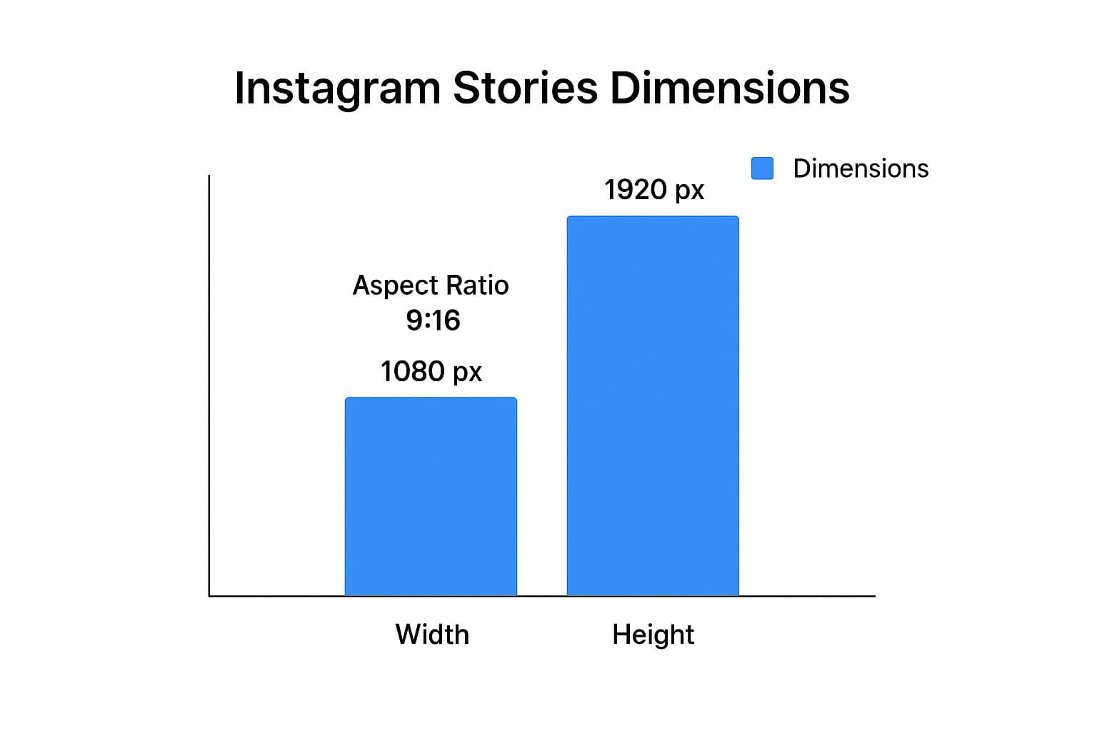
As you can see, it all comes back to that 1080 x 1920 pixel canvas. This resolution is high enough to look sharp and crisp on modern phone screens without being so large that it creates massive file sizes. It's the perfect balance of quality and performance.
Why Getting Your Story Dimensions Right Is a Game Changer
Nailing your Instagram Stories dimensions isn't just a technical box to check—it's a critical part of your strategy. When you use the correct 1080x1920 pixel size, your content fills the entire screen, creating an immersive experience that grabs your audience's attention from the very first second. Content that fits perfectly looks polished and professional, which keeps people watching and tells them your brand cares about quality.
On the flip side, getting the dimensions wrong can seriously hurt your content's performance. Mismatched visuals often get pixelated, awkwardly cropped by the app, or stuck between ugly black bars. These little mistakes might seem minor, but they can make a brand look amateurish, leading to viewers tapping away before your message even lands.
Boost Engagement and Look Like a Pro
Instagram Stories have been a powerhouse feature since they launched back in 2016. With over 500 million users posting Stories every single day, it's a crowded space where you need every advantage to stand out. Making sure your dimensions are spot-on is one of the easiest ways to ensure your content looks its best.
A slick, full-screen story feels intentional and pulls the viewer in, which can make a huge difference in how long they watch and how much they interact. Think of it as the foundation for telling a great visual story on the platform.
Knowing how to present your brand professionally is a must, especially if you're interested in selling effectively on Instagram. At the end of the day, respecting the platform's native format is the first step to building a strong presence. For a broader look, be sure to check out our complete guide to image sizes across all major platforms.
https://postonce.to/blog/best-image-size-for-social-media
Working with the Instagram Story Safe Zone
Nailing the 1080 x 1920 pixel dimension is a great start, but it’s only half the job. To make sure your Story actually lands with your audience, you have to design within the Instagram Story safe zone.
Think of the safe zone as the central part of the screen where nothing gets blocked. Instagram overlays its own interface at the top (your profile picture and username) and the bottom (the reply bar and other interactive buttons). If you place key parts of your design in these areas, they'll get covered up.
How to Keep Your Content Visible
As a rule of thumb, leave a buffer of roughly 250 pixels at both the top and the bottom of your creative. This is your "no-go" zone for anything important.
All your critical elements—calls-to-action, poll stickers, key text, or product shots—should be placed squarely within this central safe area. This is the only way to guarantee every single person sees them. Many brands make the mistake of using the entire 9:16 canvas for a beautiful design, only to have their main CTA or a crucial link sticker hidden by the interface. As you can imagine, this kills engagement and conversions. You can dig deeper into how dimensions impact conversions over on creatopy.com.
The image below gives you a perfect visual breakdown of where the safe and unsafe areas are.
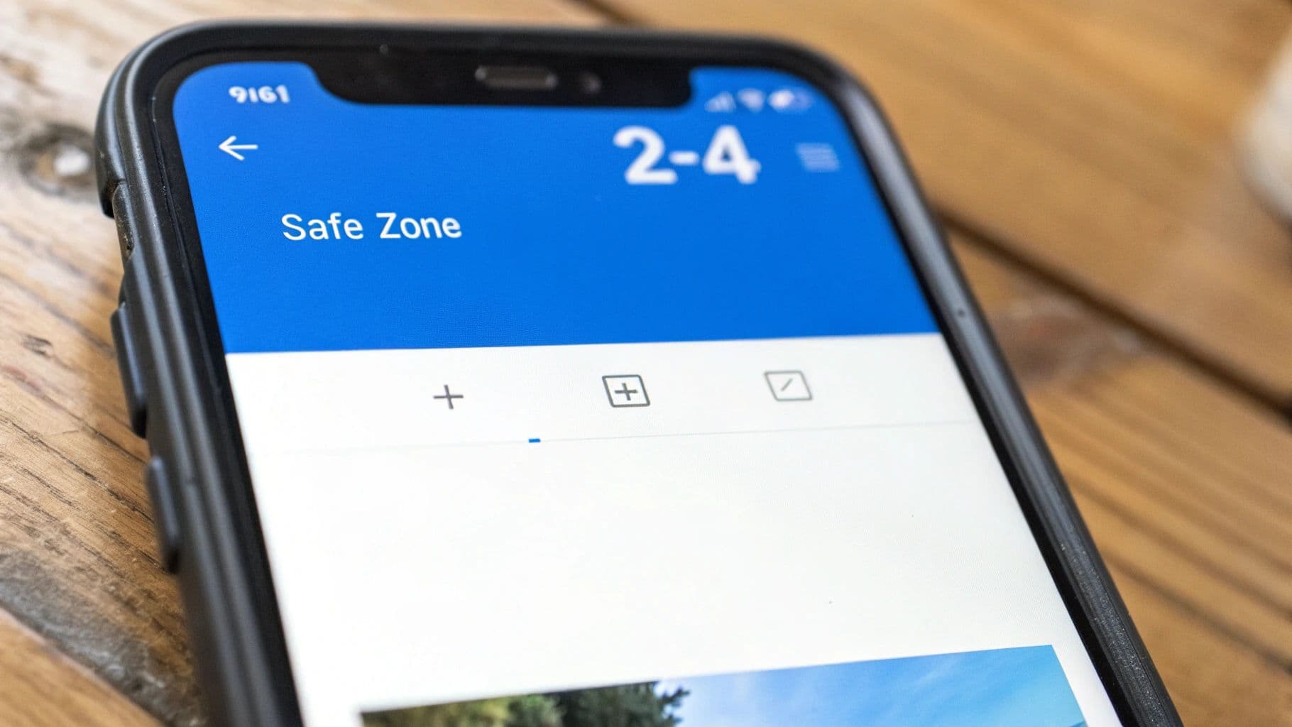
This overlay makes it crystal clear. The top and bottom sections belong to Instagram's UI, so the middle of the screen is your prime real estate. Don't waste it.
Image and Video Technical Specs
Getting the pixel dimensions right is only half the battle. To make sure your Instagram Stories look professional and perform well, you need to pay attention to the technical details like file types, sizes, and frame rates. Nailing these specs prevents Instagram from compressing your content into a pixelated mess.
For still images, stick with JPG or PNG formats. They're universally supported and offer the best quality. I usually recommend PNGs for graphics heavy on text or if you need a transparent background, but JPEGs are perfect for photographs. Just keep the file size under 30MB to avoid upload issues.
Video and Audio Requirements
Video has a few more moving parts, but they're straightforward once you know them. Getting these right is key to a smooth, high-quality playback experience for your viewers.
- File Formats: Your best bets are MP4 or MOV. I almost always use MP4 because it offers a great balance of quality and file size, and it's compatible with just about everything.
- Maximum File Size: Instagram gives you a lot of room to work with here, capping video files at 4GB.
- Frame Rate: Aim for 30 FPS (frames per second). This is the standard for smooth, natural-looking motion on a phone screen.
- Video Length: Each individual Story slide can be up to 60 seconds long. If you upload a video that's longer, Instagram will automatically slice it into 60-second chunks for you.
Think of these technical details as the foundation of your content. When your files are correctly formatted from the start, you sidestep common problems like ugly compression artifacts, quality degradation, or frustrating upload failures. It's a simple step that ensures your audience sees your work exactly as you intended.
If you want to dig deeper into how this applies to other platforms, this is a great resource covering the optimal aspect ratios for Instagram and other networks. And for a complete cheat sheet, our guide on general social media post dimensions is worth a look.
Common Story Dimension Mistakes (And How to Fix Them)
It's surprisingly easy to get the dimensions wrong on Instagram Stories, even when you think you've got it right. These small mistakes can make your content look amateurish, but luckily, they're usually simple to fix once you know what to look for.
The most common slip-up? Uploading horizontal photos or videos. When you drop a landscape image into a vertical Story, Instagram tries to "help" by slapping on massive colored bars at the top and bottom. This instantly kills the immersive, full-screen vibe and looks sloppy.
Another frequent offender is low-quality imagery. If you upload a small photo and let the app stretch it to fit the 1080x1920 pixel frame, you'll end up with a blurry, pixelated disaster. Sharp, clear visuals are non-negotiable for keeping your audience engaged and your brand looking professional.
Quick Fixes for the Top Dimension Errors
The good news is that these issues are completely avoidable with a little prep work. Taking a minute to adjust your content before you post makes all the difference.
- Fixing Horizontal Content: Don't just upload it as-is. Instead, open up a design tool like Canva or Unfold and start with a fresh 1080x1920 canvas. You can then place your horizontal image on this vertical background, giving you space to add text, a branded background color, or other creative elements.
- Avoiding Pixelation: Always, always start with a high-resolution file. If a photo looks even slightly fuzzy on your desktop, it's going to look far worse on a crisp mobile screen. Make sure you export your final Story creative at 1080x1920 pixels to lock in that clarity.
The golden rule here is simple: never let Instagram make creative choices for you. Always take control of cropping, resizing, and positioning your content yourself.
Finally, don't forget about the safe zones. It’s a classic mistake to place important text, stickers, or a crucial call-to-action too close to the edges. When you do, Instagram’s own UI elements (like the reply bar or your profile icon) will cover them up, completely defeating their purpose. Keep everything that matters safely in the middle.
Design Tips for Stories That Actually Engage
Getting the Instagram Stories dimensions right is step one, but it’s the design that makes people stop tapping and actually watch. Think of the technical specs as your canvas; now you have to create something that people want to look at. A mobile-first mindset isn't just a suggestion here, it's a requirement for success.
Readability is everything. Your goal is for someone to understand your message in a split second. Use high-contrast colors—think dark text on a light background, or vice versa. Quick tip: step outside and look at your design in bright daylight. If you have to squint to read it, your audience will too.
Keep Your Branding Consistent
Every Story you post is a little piece of your brand. Keeping a consistent look and feel is how you build a recognizable presence that people start to trust.
- Stick to Your Fonts & Colors: Use your brand’s official typography and color palette. This isn't about being rigid; it's about creating a cohesive visual experience that people instantly connect with you.
- Smart Logo Placement: If you add your logo, pick a spot within the safe zone and stick with it. The top or bottom corner usually works best. The goal is brand recall, not a giant logo that overshadows your actual message.
This kind of visual consistency makes your brand feel polished and professional. Stories might vanish in 24 hours, but the impression they create sticks around a lot longer.
Your call-to-action is the bridge between a passive view and a meaningful action. Great design leads the eye straight to what you want them to do next, whether that’s swiping up, tapping a link, or answering a poll.
Use Instagram's Native Features to Drive Interaction
Instagram gives you a whole suite of interactive stickers for a reason—they work. Using them strategically can turn passive viewers into active participants in your story.
Polls are fantastic for quick feedback, quizzes add a fun challenge, and the link sticker is your best tool for sending traffic directly to a blog post, product page, or signup form. Don't just post a picture; give people something to do.
Finally, remember that what works for Stories doesn't always translate perfectly to other formats. Each placement has its own quirks. For a deep dive into vertical video, check out our guide to Instagram Reel dimensions to make sure all your content is fully optimized.
Frequently Asked Questions
Even after you've nailed down the basics, a few common questions about Instagram Stories dimensions always seem to surface. Let’s clear up some of the most frequent sticking points so you can post perfectly formatted Stories every time.
What Happens If My Image Isn't 1080x1920?
If you upload an image or video that doesn't fit the standard 9:16 aspect ratio, Instagram has to make it work somehow. Usually, it will automatically crop or zoom in on your media to force it into the vertical frame.
This can be a problem. A horizontal photo, for example, will end up with huge, distracting colored borders at the top and bottom. To keep full control over how your content looks, your best bet is always to resize everything to 1080x1920 pixels before you even think about uploading.
Can I Use Other Aspect Ratios For Instagram Stories?
Technically, yes. While 9:16 is the gold standard for that immersive, full-screen look, Instagram does support other ratios from 1.91:1 to 4:5.
But here's the catch: anything other than 9:16 won't fill the screen. Instagram will slap on default-colored bars to fill the empty space, which can look a bit unprofessional. If you want to create a polished and engaging experience, stick with 9:16.
How Do I Find The Safe Zone On My Story?
The easiest way to stay within the lines is to use a template from a design tool like Canva. Most of their Story templates come with safe zone guides already built-in, taking the guesswork out of it.
If you're designing from scratch, a good rule of thumb for a 1080x1920 canvas is to keep about 250 pixels of empty space at the very top and bottom. Make sure no text, logos, or crucial call-to-action buttons sneak into that buffer zone. This ensures Instagram’s interface elements, like your username or the reply bar, won't cover them up.
Stop resizing and start automating. With PostOnce, you can create your content once and let the platform handle the rest, automatically optimizing dimensions for every social network. Discover how PostOnce can simplify your workflow.