If you're in a hurry, let's get straight to the point: there’s no single magic size for all social media posts. Every platform—and every placement on that platform, from feeds to stories—has its own ideal dimensions. The most common ones you'll see are 1080x1080 pixels for a classic square, 1080x1350 pixels for a portrait post, and 1080x1920 pixels for full-screen stories.
Getting these dimensions right is your first step to looking professional online. Nobody wants blurry images or, even worse, that awkward, automatic crop that cuts off half your message. When your content fits perfectly, it looks native to the platform and instantly feels more credible.
Master Cheat Sheet for Top Social Media Platform Dimensions
Think of this as your go-to reference. Before we get into the nitty-gritty details for every single platform, use this table for a quick lookup of the dimensions you'll need most often.
| Platform | Placement Type | Recommended Dimensions (px) | Aspect Ratio |
|---|---|---|---|
| Square Feed Post | 1080 x 1080 | 1:1 | |
| Portrait Feed Post | 1080 x 1350 | 4:5 | |
| Stories & Reels | 1080 x 1920 | 9:16 | |
| Standard Feed Post | 1080 x 1080 | 1:1 | |
| Stories | 1080 x 1920 | 9:16 | |
| Image Post | 1200 x 1200 | 1:1 | |
| TikTok | Full-Screen Video | 1080 x 1920 | 9:16 |
This table makes one thing clear: optimizing your visuals for each platform isn't just a "nice to have"—it's essential for getting results. We've seen that posts following the recommended dimensions can get up to 45% more engagement. It makes sense; a portrait post on Instagram at 1080 x 1350 pixels simply takes up more of the screen on a mobile phone, making it harder to ignore.
A good online image resizer is a lifesaver here, allowing you to quickly adapt one creative into several optimized versions without a headache.
The image below really drives home why a one-size-fits-all approach just doesn't work. It visually compares the ideal aspect ratios for feed posts across top platforms.
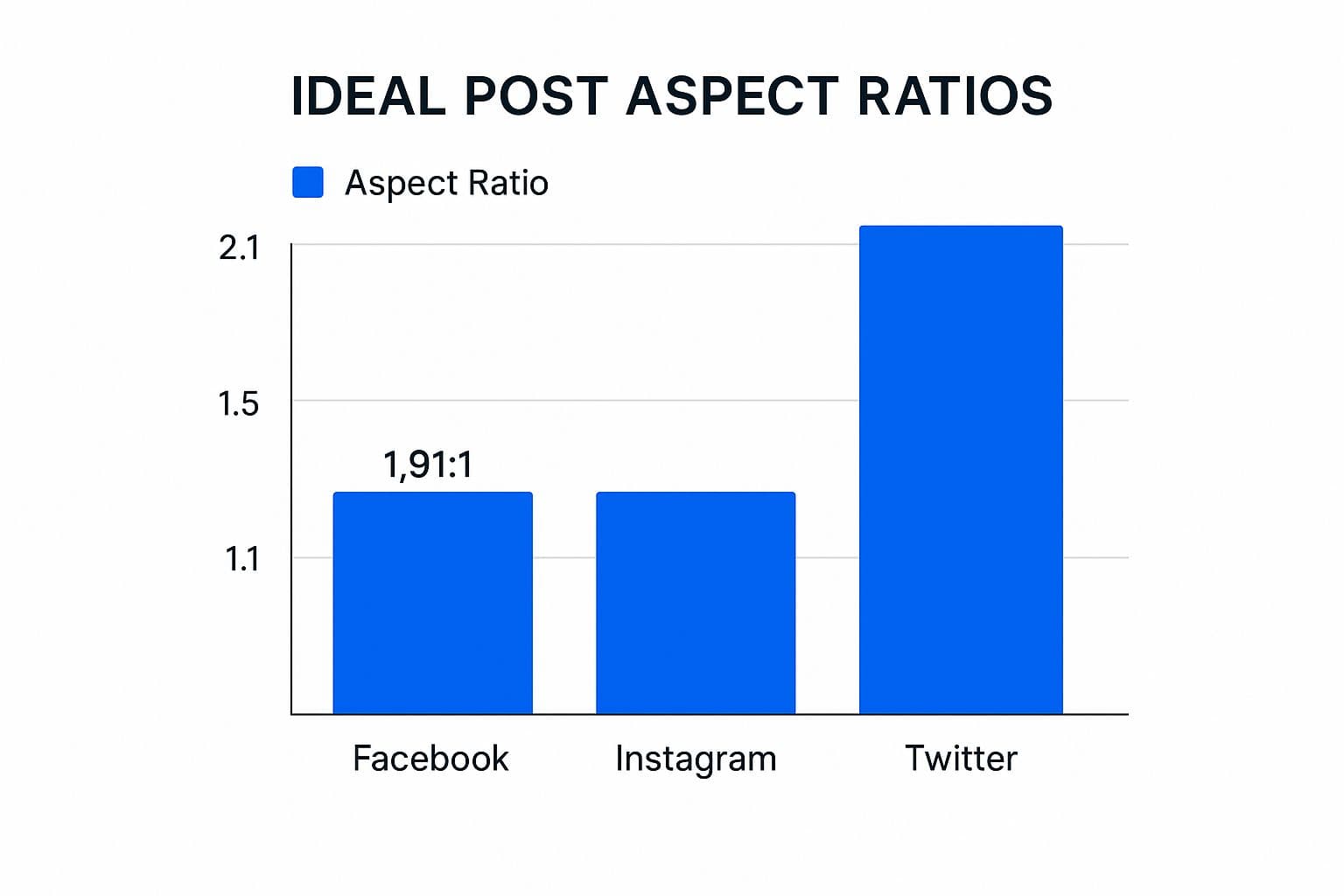
As you can see, what looks perfect on one platform might get awkwardly cropped on another. Taking a moment to resize your assets is a small step that makes a huge difference in how your brand is perceived.
Why Correct Post Dimensions Drive Performance
Getting your social media post dimensions right isn't just about avoiding blurry or awkwardly cropped images. It's a fundamental piece of your content strategy that directly shapes how people see and engage with your brand. Think of it as your first, and best, defense against the platform's own algorithms.
Every social network automatically compresses and resizes your media to fit its feed. When you upload a file that doesn't match the recommended dimensions, you’re basically forcing the platform to make some aggressive—and often unflattering—adjustments. This is where you get pixelation, strange distortions, or even worse, the platform chopping off the most important part of your message.
By providing a perfectly sized file, you stay in control of your creative. Instead of letting an algorithm decide what’s important, you present your content exactly as you intended. The result is a sharper, more professional appearance every single time.
Maximizing Engagement and Brand Perception
It's simple: a well-optimized image or video doesn't just look better; it performs better. Visuals that fill the screen properly, like the vertical 1080x1350 format on Instagram, are far more immersive and grab more attention in a crowded feed. This improved user experience often translates directly into higher engagement rates.
On the flip side, a badly cropped image can make a brand look careless. It’s a small detail, but it signals a lack of attention that can chip away at the trust you've built with your audience. For a truly consistent and powerful social presence, it's wise to build these specs into a larger strategy. A good place to start is by developing comprehensive brand guidelines for social media to ensure every post hits the mark.
The Clear Advantage of Optimized Visuals
The difference between an optimized post and one that isn't is night and day. Just think about these two common scenarios:
- Optimized Post: A clothing brand posts a vertical image using a 4:5 aspect ratio. The entire outfit is visible, the model's face isn't cut off, and the call-to-action text is perfectly clear.
- Poorly Cropped Post: The same brand uploads a wide landscape photo. The platform automatically crops it into a square, cutting off both the model's head and the shoes, making the whole image confusing and ineffective.
Mastering these technical details is absolutely essential for effective social media marketing. If you want to dive even deeper into sizing, you can check out our complete guide on the https://postonce.to/blog/best-image-size-for-social-media.
Getting Your Instagram Post Dimensions Just Right
Instagram is all about the visuals, so getting your post dimensions right isn't just a small detail—it's everything. Using the correct sizes means your images and videos look sharp, professional, and don't get awkwardly cropped by the app. From the main feed to Stories and Reels, each placement has its own set of rules for what works best.
The platform has come a long way. Many of us remember the old days when every single post had to be a perfect 640 x 640 pixel square. This forced a rigid 1:1 aspect ratio on everyone. That all changed back in 2015 when Instagram finally introduced support for portrait and landscape photos, giving creators some much-needed breathing room. Today, the specs are even more dialed in, with a standard width of 1080 pixels being the gold standard for high-quality feed posts.
Instagram Feed Post Dimensions
Think of your Instagram feed as your brand’s visual storefront. This is where first impressions are made, so optimizing your posts here is critical. While Instagram gives you three orientations to choose from, one of them has a clear advantage for grabbing your audience's attention.
Here are the specs you need to know for single image or video posts on the feed:
- Square (1:1): The classic format. Go with 1080 x 1080 pixels. It’s a safe, balanced option that always looks good in the grid view on your profile.
- Portrait (4:5): This is your secret weapon. At 1080 x 1350 pixels, this vertical format takes up the most screen space on a phone, making your content harder to just scroll past.
- Landscape (1.91:1): The widest option, use 1080 x 566 pixels. This one occupies the least vertical space in the feed, so I'd recommend using it sparingly unless your image absolutely demands it.
Pro Tip: I almost always recommend using the 4:5 portrait format (1080 x 1350 px) for key feed content. That extra vertical real estate can make a real difference in how long people look at your post, which often translates to better engagement.
Stories and Reels Dimensions
For that full-screen, immersive experience, Stories and Reels are king. Luckily, they share the same vertical dimensions, which makes creating content for both a bit easier. This format is specifically designed to fill an entire mobile screen.
- Recommended Dimensions: 1080 x 1920 pixels
- Aspect Ratio: 9:16
A quick word of advice when you're designing for Stories and Reels: always be mindful of the "safe zones." Instagram places UI elements like your profile icon, the comment box, and various buttons at the top and bottom of the screen. Make sure you keep any important text, logos, or calls-to-action away from the edges so they don't get covered up.
Carousel Post Dimensions
Carousels are fantastic for telling a story, showing off a product from multiple angles, or walking people through a tutorial with up to 10 images or videos. You can use square, portrait, or landscape formats for your carousels, but here's the catch: you have to stick with one orientation for the entire post.
The very first slide you select locks in the aspect ratio for the whole carousel. If you try to mix and match different sizes, Instagram will just crop every other slide to match the first one. To get the most bang for your buck, I highly recommend building your carousels using the portrait (1080 x 1350 pixels) format.
For those of you juggling multiple accounts, figuring out how to adapt these formats efficiently is a game-changer. Our guide on social media cross-posting has some great strategies to help streamline your workflow.
Facebook Image and Video Dimension Guide
With nearly 3 billion monthly active users, Facebook is still the undisputed giant of social media. For any brand, this means getting your visual specs right isn't just a good idea—it's essential. Facebook places your content everywhere, from the main feed and Stories to your business page, and each spot has its own rules for displaying media.
Nailing these dimensions is the difference between a professional, polished look and one that's awkwardly cropped or blurry. Think of following the correct social media post dimensions as the first step to controlling your brand’s story and making sure your content actually connects with people.
Facebook Feed Post Dimensions
The News Feed is where your brand will get the most eyeballs, so making your images look great here should be your top priority. Facebook is pretty flexible with orientations, but the size you pick can seriously impact how much screen space you own, especially on mobile.
Here are the recommended sizes you should be working with for standard feed posts:
- Square (1:1): This is your safest bet. At 1080 x 1080 pixels, it's a versatile format that looks clean and consistent across all devices.
- Vertical (4:5): To really stop the scroll, go with 1080 x 1350 pixels. This format takes up more vertical real estate in the mobile feed, making it much more engaging and harder to ignore.
- Landscape (1.91:1): If you have a great wide shot, 1200 x 630 pixels is the way to go. Just be aware that it occupies the least amount of space in the feed.
For most day-to-day content, a square or vertical post will give you the most bang for your buck. It’s also a good habit to keep your JPG file sizes under 100KB to make sure they load quickly.
Key Branding Asset Dimensions
Your profile and cover photos are the face of your brand on Facebook. They’re often the very first thing a visitor sees, so crisp, high-quality images here are completely non-negotiable.
Facebook Profile Picture
Your profile picture is the little circular icon that follows your brand everywhere—on your page, in comments, and in search results. It’s your digital handshake.
- Recommended Size: Upload an image that is at least 320 x 320 pixels. Bigger is fine, as long as it's square.
- Display Size: It renders at 176 x 176 pixels on desktops and 196 x 196 pixels on smartphones.
- Important Note: Facebook crops your profile picture into a circle. Always make sure your logo or the most important part of the image is dead center so it doesn't get cut off.
Facebook Cover Photo
The cover photo is that big banner stretching across the top of your page. It’s a fantastic canvas for creative branding, but it’s notoriously tricky because it displays differently on desktop and mobile.
- Recommended Size: 851 x 315 pixels.
- Desktop Display: 820 x 312 pixels.
- Mobile Display: 640 x 360 pixels.
To design a cover photo that looks great everywhere, place all your critical text and logos within a central "safe zone." This simple trick prevents anything important from being cropped when viewed on a phone.
Facebook Stories and Link Images
Just like on Instagram, Facebook Stories provide a full-screen, immersive format that's perfect for grabbing attention. You need to optimize for it.
Facebook Stories Dimensions
Stories are built for vertical, mobile-first viewing and conveniently share the same specs as Instagram Stories.
- Recommended Dimensions: 1080 x 1920 pixels.
- Aspect Ratio: 9:16.
Finally, when you share a link, the image that Facebook pulls in (often called an Open Graph or OG image) is your best tool for getting clicks. A sharp, compelling image can be the reason someone clicks your link instead of scrolling past it. The ideal size for link preview images is 1200 x 628 pixels.
Getting Your Visuals Right on X (Twitter) and LinkedIn
While Instagram and Facebook are all about visual storytelling, X (formerly Twitter) and LinkedIn demand a different, more strategic approach to your social media post dimensions. These platforms are hubs for fast-paced conversation and professional networking. To make an impact, your visuals have to be sharp, clear, and perfectly sized to stop the scroll and earn respect.
Think about it this way: on X, where every character is precious, a well-sized image can make your tweet pop in a sea of text. Over on LinkedIn, a polished visual is a direct reflection of your professional credibility. Nailing the dimensions isn't just a technical detail; it's about looking competent and making sure your content gets the serious attention it deserves.
X (Twitter) Image and Header Dimensions
X is built for speed and real-time engagement, so your images must be optimized for quick glances. The platform is flexible with aspect ratios, but if you don't stick to the recommended specs, you risk your visuals getting awkwardly cropped. This is especially true on mobile, which is where most people are scrolling through their feed.
Here are the key dimensions you'll want to have handy for X:
- Profile Photo: 400 x 400 pixels. This is your brand's face, appearing everywhere as a circle. Make sure your logo or headshot is perfectly centered and legible.
- Header Photo: 1500 x 500 pixels. Think of this as your personal billboard. Be aware that there's a "safe zone" to consider—about 60 pixels at the top and bottom can get cut off depending on the viewing device. Always keep your most important info near the center.
- In-Feed Image (16:9 Landscape): 1280 x 720 pixels. This is a great, standard option that works especially well for sharing links and displaying wide photos.
- In-Feed Image (1:1 Square): 720 x 720 pixels. Square images are known to perform quite well, offering a clean, balanced look in the timeline.
Key Insight: While you can post vertical images on X, a landscape (16:9) or square (1:1) format is usually the safer choice. These formats ensure your entire visual is seen at once, without forcing someone to click to see the full picture.
LinkedIn Dimensions for a Professional Polish
LinkedIn is the definitive network for B2B marketing and building your professional brand, so there's absolutely no room for error with your visuals. A blurry or poorly cropped image here can instantly damage your credibility. Every single asset, from your personal profile to your Company Page, must be sharp and correctly sized.
Remember, when you post on LinkedIn, your audience consists of peers, potential clients, and even future employers. The details matter, big time.
Critical LinkedIn Asset Sizes
To build a professional and trustworthy presence, start by getting these core branding and content dimensions right:
- Personal Profile Photo: 400 x 400 pixels. A clear, high-quality headshot isn't optional; it's a requirement.
- Personal Cover Photo: 1584 x 396 pixels. Use this valuable real estate to showcase your area of expertise or a compelling personal brand statement.
- Company Page Logo: 400 x 400 pixels. This is the main logo that shows up next to all of your company's posts and comments.
- Company Page Cover Image: 1128 x 191 pixels. It's a wide, panoramic space perfect for powerful brand messaging or a team photo.
When it comes to the content you share in the feed, the right image can dramatically increase engagement. For shared links, using a custom image at 1200 x 627 pixels is the best way to maximize clicks. For posts where the image is the main event, a square 1200 x 1200 pixel graphic is a strong and versatile choice that looks great on any device.
Juggling all these different formats can feel like a chore, but understanding the best practices for crossposting on social media platforms can help you develop a smart workflow that saves time without sacrificing quality.
TikTok and Pinterest: Mastering Vertical Media
On visually-driven platforms like TikTok and Pinterest, vertical content isn't just another option—it’s the main event. If you want to grab someone's attention, you have to create content in the format they expect. For these two, getting the aspect ratio right is even more critical than hitting the exact pixel count.
This whole shift to vertical isn't a random trend; it's a direct response to how we all use our phones. With mobile devices now accounting for roughly 60% of all internet traffic, it was only a matter of time before platforms optimized for how we hold them. The explosive growth of TikTok, which now has over 1 billion monthly users, has pretty much cemented the 9:16 aspect ratio as the king of short-form video.
TikTok Video and Profile Specs
TikTok’s entire platform is built around a full-screen, immersive vertical experience. To look like you know what you're doing, your content has to fit that mold perfectly. Otherwise, you'll end up with those dreaded black bars or awkward, unprofessional cropping.
- TikTok Video Dimensions: The standard is 1080 x 1920 pixels. This gives you a perfect 9:16 aspect ratio, which is exactly what the platform is designed for.
- Mind the Safe Zones: This is a big one. Always keep your most important text, logos, or visual elements away from the edges of the screen. TikTok overlays its interface elements—your username, the caption, and engagement icons—on the top, bottom, and right side. Leave a healthy margin so nothing important gets blocked.
- Profile Photo: Your profile picture should be sharp and clear. A minimum size of 200 x 200 pixels works best.
Because TikTok videos and Instagram Reels both use the same 9:16 vertical format, this is also one of the easiest workflows to automate. If your goal is to reuse TikToks on Instagram without manual downloads, use a TikTok to Instagram crossposting workflow so the video stays in the right format and publishes as a native Reel.
Pinterest Pin Specs for the Best Performance
Think of Pinterest as a visual search engine where taller Pins dominate because they take up more real estate on the feed. While the platform is flexible with different sizes, the content that really pops is almost always vertical.
Key Insight: A 2:3 aspect ratio is the sweet spot for a Standard Pin. It gives you a great visual presence in the feed without being so tall that it gets cut off. A 1000 x 1500 pixel Pin is what many consider the gold standard.
Here’s a quick breakdown of the most common Pin types and their ideal dimensions:
- Standard Pins: Stick to a 2:3 aspect ratio. A common and highly effective size is 1000 x 1500 pixels. You can go taller, but anything beyond 2:3 risks getting truncated in people's feeds.
- Video Pins: These also do best with a vertical format. You can use the standard 2:3 ratio, or you can go full-screen with a 9:16 ratio (1080 x 1920 pixels) for a more immersive mobile experience.
- Idea Pins: This multi-page format, which functions a lot like Stories, is designed specifically for a 9:16 aspect ratio (1080 x 1920 pixels).
For an even more detailed look at getting your visuals just right, check out this excellent Pinterest Pin Size Guide. Following these specs ensures your content looks polished and is ready to be discovered and saved by users.
Your Top Questions About Post Dimensions, Answered
Even with a cheat sheet handy, a few common questions always seem to pop up when we talk about social media post dimensions. Think of this section as a quick reference for those nagging "what if" and "why does it matter" questions that come up in the middle of a project.
Getting these details right is what separates professional-looking content from sloppy posts. So, let's clear up the confusion and get you posting with confidence.
What Is an Aspect Ratio and Why Is It So Important?
An aspect ratio is just the relationship between an image's width and its height. It's written as two numbers with a colon, like 1:1 for a perfect square or 9:16 for a tall, vertical video. It’s not about the specific pixel size, but the shape of the image itself.
Why does this matter so much? Because every social media feed has predefined "slots" for content. If your image doesn't match the required aspect ratio, the platform will automatically crop it to force a fit. This is how you end up with awkward framing, chopped-off heads, or unreadable text. Nailing the aspect ratio is your guarantee that what you see in your design file is exactly what your audience will see on their screen.
Can I Use One Image Size for All Social Platforms?
While it sounds like the ultimate time-saver, using a single image size everywhere is a mistake. Each platform is built for a different viewing experience, and what looks fantastic on one network will look awkward and out of place on another.
Here's a practical example:
- A classic 1:1 square post (1080 x 1080 pixels) is the gold standard for an Instagram or Facebook feed.
- But if you use that same square image on Pinterest, it will get lost. Pinterest's feed is built for vertical 2:3 aspect ratio images that take up more screen real estate and grab attention.
A much better approach is to create a primary design and then quickly adapt it for your most important formats. Your three must-have sizes will almost always be 1:1 (square), 4:5 (vertical feed post), and 9:16 (Stories and Reels). Most modern design tools have a resize feature that makes this incredibly simple.
What Happens If I Upload a Larger Image?
As long as you've got the correct aspect ratio, uploading an image that’s larger than the recommended pixel dimensions is actually a smart move. When you do this, the social media platform simply compresses and downsizes the file to its standard display size.
By giving the platform’s compression algorithm a bigger, higher-resolution file to start with, you'll almost always get a sharper and crisper final result. The key is to respect the aspect ratio to prevent weird cropping and keep an eye on maximum file sizes, which are usually around 30MB for platforms like Instagram.
How Do I Find an Image's Dimensions?
You don't need any fancy software to check an image's dimensions; the tools are built right into your computer. Knowing how to quickly check your social media post dimensions before uploading is a fundamental skill.
- On a Windows PC: Just right-click the image file, select "Properties," and then head to the "Details" tab.
- On a Mac: Right-click the file and choose "Get Info."
In both cases, you'll see the dimensions listed clearly in pixels.
Quick Tip: If you have an image open in pretty much any photo viewer or editor, you can often find the dimensions in a status bar at the top or bottom of the window. If not, look for a menu option like "Image Size," "Adjust Size," or "Canvas Size."
Stop wasting time resizing images for every single platform. With PostOnce, you can design your content once and our smart automation takes care of the rest. We automatically adapt your posts to the perfect dimensions and best practices for every network, so your brand always looks its best. Simplify your social media workflow with PostOnce today.