
















You've probably done this before. You finish a strong social post in Canva or Figma, feel good about the layout, then remember you still need versions for Instagram, LinkedIn, X, Facebook, and maybe Stories or Reels. The design work is done, but the production work is just starting.
That's the exact problem PostOnce is built to solve. It exists for the underlying search intent behind social media posts design: not just making one good visual, but creating once and getting that content distributed across multiple networks without repeating the same formatting job by hand.
That shift matters because social media isn't a side channel anymore. There were about five billion social media users worldwide in 2023, and the number of user identities reached 5.66 billion by October 2025 according to Statista's social network market overview. When content moves at that scale, design has to do two jobs at once. It has to look good, and it has to survive different feeds, crops, screen sizes, and reading habits.
A lot of advice about design stops too early. It tells you to “keep it clean” or “use brand colors” without addressing the actual bottleneck, which is operational. If you're building an audience, selling a service, or publishing on behalf of a client, the hard part isn't coming up with one post. It's creating a workflow that lets you publish polished visuals consistently. If you need a broader primer on engaging your readers online, that resource is a useful companion to the design workflow here.
Stop Designing Posts One by One
Designing each post as a standalone piece feels creative. It also creates a production mess.
The usual pattern is easy to recognize. A marketer builds one square post for Instagram, then opens a second file for LinkedIn, trims copy for X, stretches the layout for Facebook, and later realizes the Story version needs a different crop because the headline now sits too low. Nothing is wrong with any individual step. The problem is that the process doesn't scale.
When teams work this way, they confuse content creation with asset replication. Those are different jobs. The first requires judgment. The second is repetitive production work that drains time from strategy, writing, and testing.
Why this breaks down fast
A one-off design process usually creates four problems:
- Inconsistent branding: Colors, spacing, text size, and logo placement drift between versions.
- Late-stage fixes: Someone notices mobile text is too small only after the post is already queued.
- Slow approvals: Reviewers aren't looking at one approved system. They're checking several improvised variants.
- Creative fatigue: Designers spend more time resizing than thinking.
The fastest way to make social content feel chaotic is to rebuild the layout every time you publish.
This is why strong social media posts design starts with a system, not a single graphic. You need a repeatable visual structure that can stretch, crop, and simplify without losing the message. That means deciding in advance what stays fixed, what flexes, and what gets removed when space gets tight.
What good teams do instead
They stop treating every platform as a blank canvas. They create one master concept, define the hierarchy, and adapt from that source. The workflow becomes predictable:
- Build the message first
- Design one master version
- Adapt by format, not by whim
- Publish through a repeatable process
That's the difference between posting occasionally and running content operations cleanly.
The Core Principles of Great Social Media Design
Most weak social graphics don't fail because the brand colors are wrong. They fail because the viewer can't understand the point quickly enough.
Effective social media post design depends on visual hierarchy. Guidance from design experts recommends limiting the composition to a few key elements, prioritizing readability on mobile, and using contrast in color and size to guide the viewer's eye to the main focal point within seconds, as explained in this practical guide to eye-catching social visuals.

Visual hierarchy comes first
What it is: visual hierarchy is the order in which people notice elements.
Why it matters: feeds move fast. If the eye lands on the logo before the message, or on a decorative icon before the offer, the design is working against you.
How to use it: make one element clearly dominant. Usually that's the hook, headline, or main visual. Supporting text comes second. Brand marks come later.
A simple rule works well in practice:
- Primary layer: One headline or visual claim
- Secondary layer: One short support line
- Tertiary layer: Brand, CTA, or small identifier
If everything is loud, nothing is loud.
Readability beats decoration
A lot of junior designers add more because the canvas looks empty. On social, empty space is often doing useful work. Whitespace is like breathing room in a conversation. It gives each idea enough separation to be understood.
When you're checking a draft, ask:
- Can the main message be read quickly
- Does the text still hold up on a phone screen
- Have I added anything that doesn't help comprehension
If the answer to the last question is yes, remove it.
Practical rule: If a post needs explanation before it makes sense, the layout isn't finished.
Color and type need jobs
Color shouldn't just “match the brand.” It should organize attention. Use contrast to separate headline from background, data point from annotation, or button from body copy. Save accent colors for emphasis. If every element uses the accent color, the accent stops working.
Typography works the same way. Pick a small type system and stick to it. One display style, one body style, maybe one compact label style. More than that usually adds friction.
Here's what tends to work:
| Element | Best practice |
|---|---|
| Headline | Short, bold, obvious |
| Supporting text | Brief, high contrast, easy to scan |
| CTA | Clear and visually separated |
| Fine print | Use sparingly or remove for social |
For niche industries, the same principles apply. A financial advisor, local retailer, and legal practice all need clarity before style. If you want a sector-specific example of audience positioning and content framing, these effective law firm social media strategies show how message clarity shapes execution.
Borders, spacing, and containment
Designers often overlook boundaries. A good border, safe margin, or content frame can keep the composition from feeling like it's spilling off the canvas. This matters even more in video-first environments where thumbnails and cover frames need a clear center of gravity. A practical reference is this guide to using borders in video design, especially when you need a visual container without adding clutter.
The strongest posts usually feel simple because someone made many disciplined choices. They reduced the number of elements, increased contrast, trimmed text, and made sure the eye knew where to go first.
A Complete Platform-by-Platform Spec Sheet
A polished square post doesn't automatically become a good Story, Reel, or LinkedIn graphic. Different platforms reward different behaviors, and format is part of that behavior.
Visual format strongly affects engagement by platform. On Facebook, short-form video attracts 48% of user interaction, compared with 32% for text posts and 22% for live video, and on Instagram engagement remained 0.48% in 2025 versus 0.15% on Facebook according to Sprout Social's platform statistics roundup. The same source says Reels made up more than half of all ads shared on Instagram in 2025. The practical takeaway is simple: format choice isn't cosmetic. It changes how people interact.
Think in placements, not platforms
When someone says “design for Instagram,” that's still too broad. Feed, Stories, and Reels are different viewing environments. The same is true across Facebook and LinkedIn. Good social media posts design starts by matching the asset to the placement.
Here's a working spec sheet you can use as an operational starting point.
Social Media Image and Video Specifications for 2026
| Platform | Placement | Dimensions (px) | Aspect Ratio | Max Video Length |
|---|---|---|---|---|
| Feed post | 1080 x 1080 | 1:1 | Keep short for feed viewing | |
| Portrait feed | 1080 x 1350 | 4:5 | Keep short for feed viewing | |
| Stories | 1080 x 1920 | 9:16 | Platform supports longer video, but concise is easier to consume | |
| Reels | 1080 x 1920 | 9:16 | Platform supports longer video, but the opening seconds do the heavy lifting | |
| Feed image | 1080 x 1080 | 1:1 | Short-form video is often the better fit | |
| Vertical video | 1080 x 1920 | 9:16 | Best treated as short-form | |
| Feed image | 1200 x 1200 | 1:1 | Keep concise and professional | |
| Landscape image | 1200 x 627 | Approx. 1.91:1 | Use for charts, announcements, and article promotion | |
| X | Image post | 1600 x 900 | 16:9 | Short clips and visual summaries work well |
| Pin | 1000 x 1500 | 2:3 | Longer video can work, but static pins still need a strong title area | |
| Threads | Feed visual | 1080 x 1350 | 4:5 | Keep text light and easy to scan |
This is less about memorizing numbers and more about preserving intent. If your post relies on a bold quote card, square or portrait usually holds the message better. If it depends on a chart or comparison, a wider frame may give labels more room.
For more updated dimension handling across networks, this reference on social media post dimensions is a useful operations bookmark.
What changes by network
Instagram rewards visual immediacy. Dense text blocks usually feel heavy there. LinkedIn can tolerate more structure, especially for professional tips, data snapshots, or hiring posts. X benefits from directness. Pinterest wants a strong title zone and vertical stacking. Facebook often responds better when motion leads.
That doesn't mean every post needs a unique concept. It means each version needs a deliberate framing choice.
A practical adaptation pattern looks like this:
- Instagram Feed: Lead with image quality, bold hook, minimal copy on canvas.
- Stories and Reels: Build for vertical viewing, with key text placed safely away from interface edges.
- LinkedIn: Give charts, process graphics, and educational carousels more breathing room.
- X: Strip the design down to one idea.
- Pinterest: Design like a cover that previews the value clearly.
- Threads: Keep visuals lighter and less overdesigned.
A good multi-platform asset doesn't look identical everywhere. It keeps the same message while changing shape for the context.
If LinkedIn is part of your mix, DMpro's 2026 LinkedIn standards are worth reviewing alongside your design templates, especially for image proportions and feed-safe layout decisions.
Building a Reusable Visual System and Templates
A fictional brand is the easiest way to show this. Let's use a small consulting studio called Northline. They publish insights, client education, hiring updates, and occasional data graphics. At first, they designed each post from scratch in Canva. The result was familiar: decent individual posts, weak brand consistency, and too much time spent nudging boxes around.
They fixed it by building a visual system instead of a folder full of random templates.
Start with one master structure
Northline created a master square post with five locked decisions:
- Brand frame: same logo treatment and corner placement
- Type pair: one headline style, one body style
- Color roles: one background family, one text color, one accent
- Spacing rules: consistent margins and content width
- CTA placement: same bottom-area behavior across post types
That master wasn't a finished post. It was a container.
From there, they built variations for recurring content types.
Then build content modules
The quote version used a large statement and a small attribution. The announcement version swapped in a badge area at the top. The testimonial version added a photo block. The data version reserved space for one chart and one takeaway.
That last part matters. For data-driven posts, expert guidance recommends a 5-second test. The visual should be understandable at a glance, with clear labels, concise text, and one core takeaway, as explained in this discussion of effective chart communication on social.
Northline adopted a simple rule for any chart post: one message, one chart, one sentence. Anything more became a carousel or a blog image instead of a feed graphic.
The template system they ended up with
| Template type | Best use | Design rule |
|---|---|---|
| Quote card | Sharp opinion, insight, lesson | Keep text short and dominant |
| Announcement | Launches, events, hires | Use one visual cue and one date line |
| Testimonial | Social proof | Highlight one sentence, not a paragraph |
| Data highlight | Trend or comparison | Pass the 5-second test |
| Educational tip | Process or checklist | Break into small scan-friendly blocks |
A mockup stage helps here. Before the team finalized anything, they previewed how the system would look as a set, not just as isolated posts. That catches inconsistency early. This guide to social media post mockups is helpful if you want to pressure-test layouts before you turn them into production templates.
If a template can't survive three different post types without breaking, it isn't a system yet.
A key benefit wasn't speed alone. It was judgment. Once the system existed, the team stopped making dozens of tiny style decisions every week. They could focus on message quality, which is where better content usually comes from.
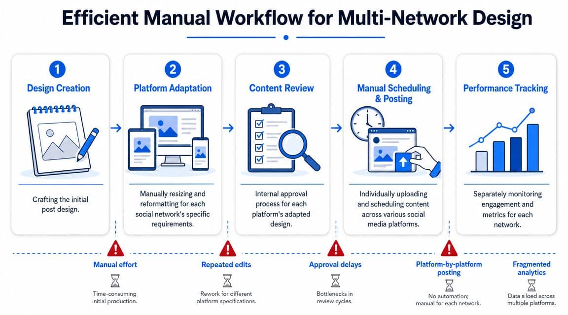
The Best Manual Workflow for Multi-Network Design
If you had to do multi-platform distribution by hand, there is a best way to do it. It's still slow, but at least it's controlled.
The strongest manual workflow starts with one master design file, not separate files for every platform. Figma or Canva are commonly used for this, with clearly named frames for each placement and a shared asset panel for logos, colors, icons, and recurring text styles.
Step 1 to 3
-
Design the source version first
Pick the version that carries the idea most clearly. For many static posts, that's a square or portrait master. For motion-led content, it may be vertical first. -
Duplicate into target placements
Create platform-specific artboards inside the same file. Don't copy into new projects unless you want version chaos later. -
Rebuild the hierarchy for each frame Errors commonly arise here. Resizing isn't enough. You often need to shorten the headline, enlarge text, move the focal point, or remove a decorative layer.
Step 4 and 5
After adaptation comes quality control.
-
Review on mobile before export
Open the file on your phone or export test images and view them at actual size. If the message gets muddy on mobile, the design isn't done. -
Export and name systematically
Use clear naming by campaign, platform, and placement. You don't want “final-v2-real-final.png” living next to six near-identical versions.
A lot of teams also use a utility for last-mile cropping and resizing if a client suddenly needs one extra format. An image resizer built for social assets is useful in those situations, especially when you're trying to avoid reopening the full source file for a minor adjustment.
What manual posting still forces you to do
Even if your file structure is clean, manual distribution creates repeated operational work:
- Upload each asset separately: Every network needs its own upload flow.
- Adjust captions by platform: Hashtags, line breaks, and CTA style rarely transfer cleanly.
- Schedule one by one: Even a good scheduler becomes fragmented when platforms are handled in separate tools.
- Track versions manually: It's easy to lose track of which crop was approved where.
This workflow is the heroic version of manual publishing. It works. Agencies and in-house teams still do it every day. But it keeps humans busy with tasks that don't improve the idea.
How PostOnce Automates Your Design Distribution
The gap in most social media posts design advice isn't aesthetics. It's adaptation.
Independent guidance on social templates points to a persistent need for format-specific adaptation across networks. The challenge involves figuring out how to reframe one asset efficiently for different feeds, aspect ratios, and viewing behaviors, which is exactly the gap described in this article on social media templates and cross-platform reuse.
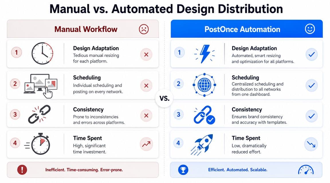
A manual workflow asks you to solve the same operational problem over and over. You design the post, create variants, upload each one, tweak each caption, and babysit each network separately. That's manageable when posting lightly. It becomes a drag the moment consistency matters.
PostOnce changes the job definition. You create the content once, connect your distribution rules, and let the platform handle cross-posting across networks from one place. That doesn't replace design judgment. It removes the repetitive handling work that sits after design.
What that changes in practice
The biggest gain isn't just time. It's continuity.
With a centralized distribution workflow, you're less likely to end up with:
- Mismatched versions posted on different networks
- Last-minute formatting errors introduced during manual upload
- Caption drift where the message changes unintentionally
- Posting gaps caused by app-switching and queue management
This matters most for creators and small teams because they rarely have a dedicated production layer. The same person writes, designs, schedules, and reports. Any repeated task steals time from content quality.
If you want to see the broader publishing model behind that approach, this guide on how to post to all social media at once captures the operational benefit well.
The automation mindset
Teams usually get the best results when they separate the workflow into two parts:
| Part | Human job | System job |
|---|---|---|
| Content creation | Message, design, hierarchy, approval | None |
| Content distribution | Routing, publishing, duplication, consistency | Automate as much as possible |
That split is healthy. Humans should decide what deserves attention. Systems should handle repetitive execution.
Here's a quick look at the kind of workflow this supports:
Good automation doesn't make the design for you. It protects the design from getting degraded during distribution.
Regarding social media posts design, a deeper question often emerges. How do I make good visuals without creating a publishing burden for myself every time? The answer isn't more hustle. It's a design system paired with an automated distribution layer.
Your Final Pre-Publish Design Checklist
Before anything goes live, run one last check. This takes a few minutes and prevents the kind of mistakes that make strong content look rushed.
Use this checklist every time
- Check mobile readability: Open the image on your phone. If the hook doesn't read fast, increase size or cut words.
- Check the focal point: Make sure the eye lands where you intended. If a logo or background texture steals attention, reduce it.
- Check platform fit: Confirm the exported asset matches the target placement. Feed, Story, and vertical video layouts shouldn't be treated as interchangeable.
- Check brand consistency: Verify font use, color roles, spacing, and logo treatment against your template system.
- Check the CTA: If the post asks for a click, reply, save, or share, the prompt should be visible and unambiguous.
- Check copy and labels: Proofread everything on the canvas, especially dates, names, prices, and chart labels.
- Check safe areas: For vertical formats, keep important text away from edges where interface elements may overlap.
- Check whether it says one thing well: If the design is trying to communicate several ideas at once, simplify before posting.
One final standard
The cleanest test is this: can someone understand the point without effort?
If yes, the design is probably ready. If not, don't add more. Remove more.
If you're tired of creating one strong visual and then spending the rest of your time resizing, re-uploading, and re-posting it everywhere else, PostOnce is the practical fix. Build the content once, keep your design standards high, and let the distribution happen without the manual grind.