Nailing your LinkedIn graphic sizes is one of the quickest ways to look polished and professional. It’s all about making a great first impression. To sidestep any awkward cropping or pixelation, stick to these core dimensions: 400 x 400 pixels for your profile photo, 1584 x 396 pixels for your personal banner, and 1200 x 627 pixels for any images you share in a post.
LinkedIn Graphic Sizes Quick Reference
Let’s be honest, nobody has time to hunt for image specs every time they need to post. Using the right dimensions from the get-go is the difference between a crisp, professional presence and one that looks sloppy. When your visuals are off—blurry, stretched, or poorly cropped—it distracts from your message and can seriously hurt engagement.
To make things easier, I've put together a quick reference table with the most common and critical LinkedIn image sizes. Think of this as your go-to cheat sheet for personal profiles, Company Pages, and posts.
| Image Type | Recommended Dimensions (Pixels) | Aspect Ratio |
|---|---|---|
| Personal Profile Photo | 400 x 400 | 1:1 |
| Personal Background Banner | 1584 x 396 | 4:1 |
| Company Page Logo | 300 x 300 | 1:1 |
| Company Page Cover Image | 1128 x 191 | 5.9:1 |
| Shared Image or Link | 1200 x 627 | 1.91:1 |
| Shared Video | 256 x 144 to 4096 x 2304 | 16:9 |
| Carousel Post (Each Card) | 1080 x 1080 | 1:1 |
Bookmark this table. It covers the daily essentials and will help you keep your brand's visuals looking sharp and effective across the platform.
Visualizing the Key Dimensions
Sometimes, seeing the sizes in relation to each other is what makes it click. This infographic does a great job of showing just how different these canvases are.
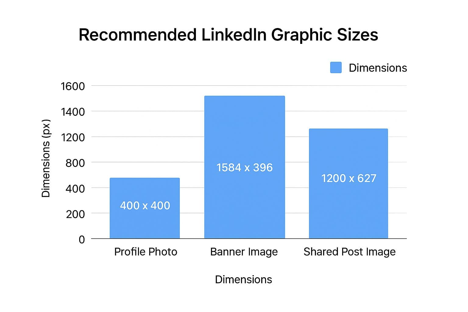
What really stands out is the stark contrast between the long, panoramic banner format and the more traditional rectangular or square shapes used for feed content. Keeping this difference in mind is absolutely critical when you're creating graphics. An image that looks great as a post might be completely unusable as a banner, and vice versa.
While our focus here is squarely on LinkedIn, your brand likely exists on other platforms too. For a wider view, you can explore our complete guide on social media post dimensions to make sure your content is optimized everywhere you post.
Optimizing Your Personal Profile Visuals
Think of your LinkedIn profile as your digital handshake—it's often the very first impression you make professionally. The first things anyone clocks are your visuals, so getting them right isn't just about looking good. It’s about building immediate credibility.
The two powerhouse visuals on your personal page are your profile photo and your background banner. LinkedIn has specific dimensions for these to keep everything looking sharp and professional, no matter where someone is viewing it—from a huge desktop monitor to a tiny phone screen.
Key Dimensions for Personal Profiles
Sticking to the official recommendations is the best way to avoid annoying cropping issues or blurry images. Here are the numbers you need to know to get it right every time.
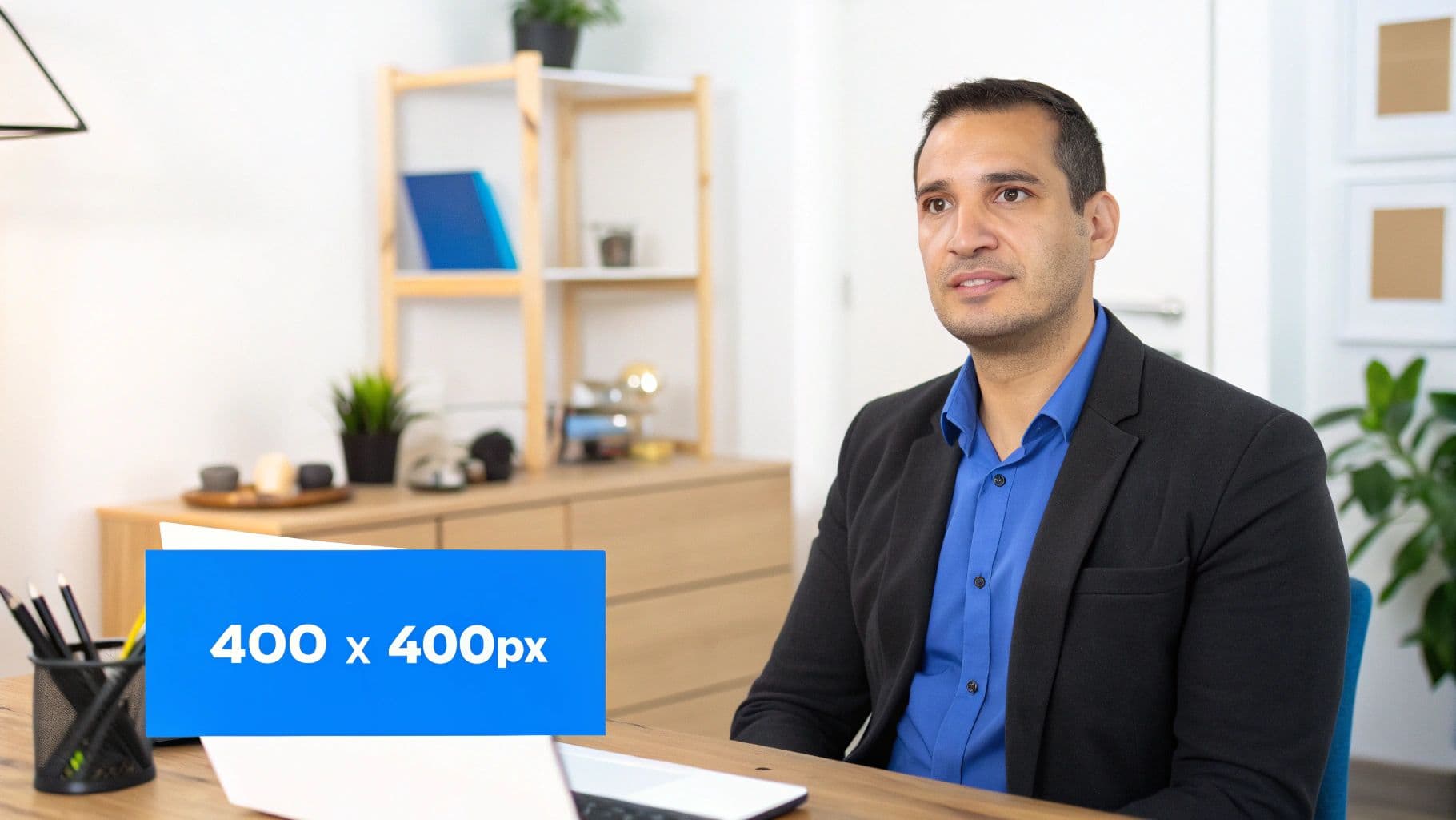
- Profile Picture: The sweet spot is 400 x 400 pixels. You might be able to upload something smaller, but this size ensures your photo looks crisp and clear.
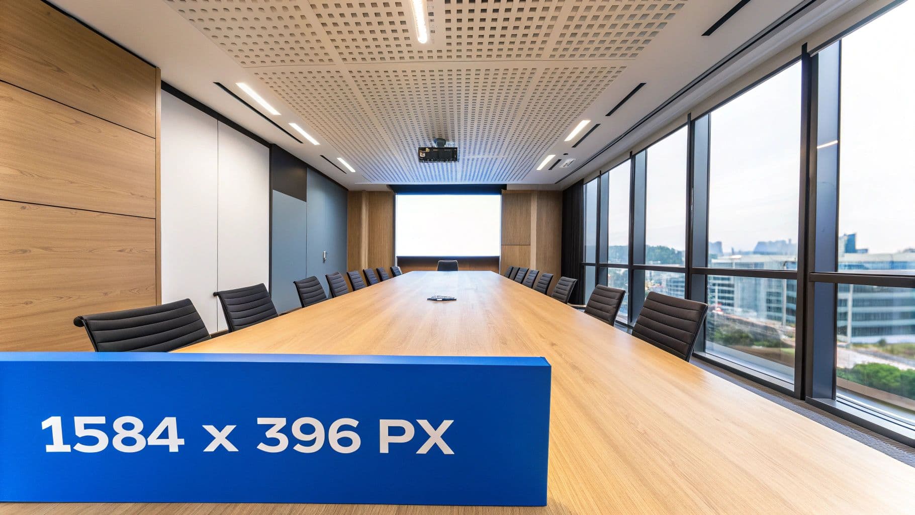
- Background Banner: You'll want to design this at 1584 x 396 pixels. It's a wide 4:1 aspect ratio, giving you a personal billboard to work with.
It's also important to watch your file sizes to keep things loading quickly. For both your profile photo and your banner, you need to stay under 8MB. The platform accepts standard formats like JPG and PNG. If you're working with brand assets, a good grasp of understanding logo file types and formats can also make a huge difference in clarity.
Best Practices for Your Profile Visuals
Hitting the right dimensions is just step one. To really make an impact, you have to think about what your images are communicating. A high-quality, professional headshot where you are clearly the main focus is non-negotiable.
Pro Tip: Your background banner is prime real estate for your personal brand. Don't waste it on a generic stock photo. Instead, create a custom graphic that shows off your expertise, a major accomplishment, or your company's mission.
For example, your banner could feature a photo of you speaking at an industry event or include a simple text overlay with your core value proposition. Whatever you choose, always double-check how your profile looks on both desktop and mobile to make sure no important details are getting cut off.
Mastering Company Page Graphic Requirements
Think of your LinkedIn Company Page as your brand's digital headquarters. It's where potential clients, partners, and future employees go to size you up. The visuals you use here are more than just decoration; they form the bedrock of your professional identity online.
Unlike a personal profile, a company page has its own set of graphic requirements built to showcase a brand, not an individual. Getting these LinkedIn graphic sizes right is non-negotiable for building trust and creating a sharp, cohesive brand experience. The two most important visuals are your company logo and the main cover image, and they need to work in tandem.
Core Company Page Dimensions
Your logo and cover image are the first things anyone sees. Using the wrong dimensions can make your brand look sloppy, with pixelated logos or awkwardly cropped banners that immediately undermine your credibility.
Here are the exact sizes you need to use:
- Company Logo: The ideal size is 300 x 300 pixels. This square logo is your brand's tiny avatar, appearing next to your company name on posts and in search results. It has to be instantly recognizable, even when small.
- Company Cover Image: Stick to the recommended 1128 x 191 pixels. This wide, panoramic banner is your brand's billboard. Use this space wisely to communicate your mission, show off a key product, or announce a current campaign.
For file types, a high-quality PNG is usually the best choice for logos, especially if they contain text or sharp geometric shapes. For photographic cover images, a well-optimized JPG will do the job perfectly.
One of the most common mistakes I see is people trying to repurpose a personal profile banner for their company page. The dimensions are completely different, and it always results in a stretched, blurry, or poorly cropped mess. Always create a dedicated graphic for your company cover.
Life Tab and Custom Module Images
If your company uses the "Life" tab to give a peek into your workplace culture and attract talent, you've got more visual real estate to manage. These images offer a much deeper look into your organization, and they have their own unique dimensions.
The "Life" tab features its own hero image, which should be 1128 x 376 pixels. If you add custom modules to the page, those images need to be 502 x 282 pixels. Finally, for the company photos section, an aspect ratio of 3:2 works best, so aim for 900 x 600 pixels. Keeping these different sizes straight is key to presenting a polished and engaging page for potential new hires.
Getting Your LinkedIn Feed Post Images Just Right
In the fast-scrolling world of the LinkedIn feed, a striking visual is your best bet to make someone pause. Getting the LinkedIn graphic sizes right for your posts isn't just about looking good; it's about presenting your content professionally to maximize its reach and engagement. While feed images offer more flexibility than profile pictures or banners, a few tried-and-true formats consistently deliver the best results.
LinkedIn actually has its own recommendations to give your visuals the most impact. The platform supports three primary aspect ratios for single-image posts: square, landscape, and portrait. Square images are a crowd favorite for their balanced look across all devices, but knowing when to use each one gives you a strategic edge.
Key Formats for Single Image Posts
Picking the right format really comes down to what you're showing and where you want your audience's eyes to go. LinkedIn will do its best to fit whatever you upload, but sticking to these dimensions ensures your image isn't cropped in some weird, unexpected way.
- Square (1:1 Aspect Ratio): The gold standard here is 1080 x 1080 pixels. It’s incredibly versatile and looks great on both desktop and mobile without any awkward resizing. Think of it as the perfect canvas for clean graphics, professional headshots, or a focused shot of a product.
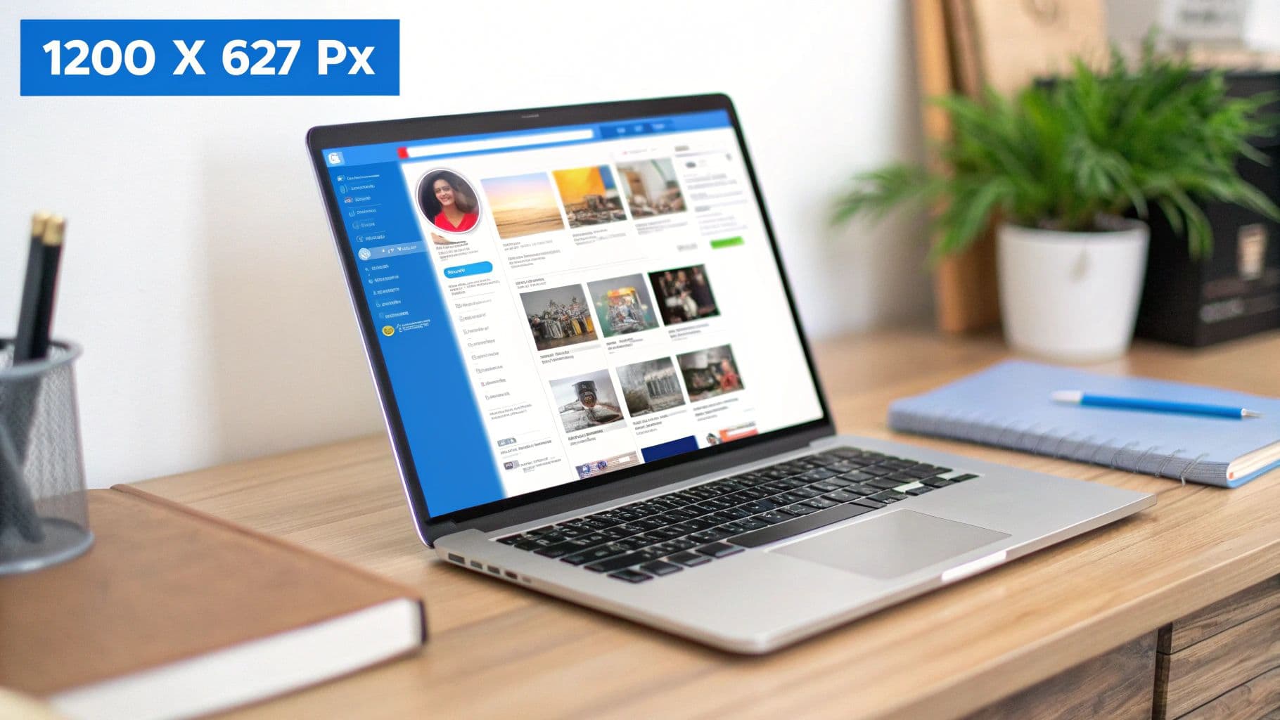
- Landscape (1.91:1 Aspect Ratio): For this format, aim for 1200 x 627 pixels. You'll recognize this as the standard size for shared link previews. It’s ideal for wider shots, like photos from an event, team pictures, or scenic backgrounds.
- Portrait (Custom Aspect Ratio): While there isn't one strict rule, a 2:3 ratio (627 x 1200 pixels) is a solid starting point. This format is a powerhouse on mobile because it takes up more vertical screen real estate, grabbing and holding a user's attention for longer.
Expert Tip: If you want to make the biggest splash, lean into portrait and square images. They simply dominate the mobile feed, where most people are scrolling through LinkedIn. A taller image forces more scrolling to get past it, which buys you precious seconds for your message to land.
Best Practices for Compelling Post Images
Getting the technical specs right is only half the battle. Knowing the correct dimensions for your LinkedIn images is a fundamental piece of any solid social media content planning. Always start with high-resolution files to avoid pixelation, keep any text on the image minimal and legible, and maintain consistent branding to build recognition.
When you're creating a multi-image carousel post, stick with the square 1080 x 1080 pixels format for every single card. This creates a clean, uniform, and professional experience as users swipe through. And while these specs are specific to LinkedIn, you can simplify your workflow by checking out our guide on the https://postonce.to/blog/best-image-size-for-social-media to help coordinate your strategy across all platforms.
Handling Video and Shared Link Image Sizes
It's not just about static image posts. To really make an impact on LinkedIn, you have to nail the visuals for your videos and any external links you share. These formats come with their own set of rules, and getting them wrong can result in awkward cropping, low engagement, and a look that just feels unprofessional.
Getting these specific LinkedIn graphic sizes right ensures every single piece of content you put out there looks polished and performs its best.
Recommended LinkedIn Video Specifications
Video is a massive part of LinkedIn now, but you need to pay close attention to the technical details. While LinkedIn is flexible, supporting a wide range of resolutions from 256 x 144 up to 4096 x 2304 pixels, the real key is the aspect ratio. This is what guarantees your video looks great on both desktop and mobile feeds.
For most videos you record, stick with a standard 16:9 aspect ratio for landscape. If you're creating something specifically for mobile viewing, like a Reel or Short, a vertical 9:16 ratio is your best bet.
- File Size: Make sure your video file stays under 5GB.
- Video Length: Your video can be anywhere from 3 seconds to 10 minutes long.
- File Formats: Stick with common formats like MP4 for the most reliable playback.
Following these guidelines helps you avoid weird compression artifacts or frustrating playback errors, giving your audience a seamless viewing experience.
The Mystery of Shared Link Images
We've all been there. You share a fantastic new blog post, but LinkedIn pulls a strange, outdated, or horribly cropped thumbnail to go with it. It’s a common headache, and it happens because LinkedIn doesn’t let you pick the image—it automatically grabs one based on the link's Open Graph (OG) tags.
The only way to control the image that appears with a shared link is to set the
og:imagetag correctly in the HTML of the source website itself. You cannot change it directly on LinkedIn after posting.
To make sure your links always show the perfect preview image, the one specified in your og:image tag should be 1200 x 627 pixels. This works out to a 1.91:1 aspect ratio. Getting this right is fundamental to making your shared content look clean and clickable.
Consistently using the correct image dimensions is a non-negotiable part of a strong content strategy. If you're juggling multiple platforms, understanding the finer points of social media cross-posting is a huge time-saver that helps keep your brand looking sharp everywhere.
Getting Your Graphics Right for LinkedIn Ads and Events
Once you’ve moved past your organic posts, you’ll find that promotional content on LinkedIn has its own rulebook. Both LinkedIn Ads and Events have specific image sizes you need to follow. Getting these dimensions right isn’t just about looking good—it’s critical for your campaign’s success. The last thing you want is a poorly cropped ad that tanks your performance, wastes your budget, and makes your brand look sloppy.
Unlike your everyday feed posts, ad visuals are held to a much stricter standard. This ensures they look sharp and professional everywhere they appear, from a desktop feed to a mobile app and even across the LinkedIn Audience Network. This precision is what prevents your call-to-action from getting chopped off or your logo from being awkwardly hidden.
The Essential Dimensions for LinkedIn Ads
If you're running any paid campaigns, you need to know these numbers by heart. Each ad format on LinkedIn is built for a specific job, and the image dimensions are optimized to help you hit that goal. Nailing these sizes is the first step to getting a great return on your ad spend.
- Single Image Ads: This is your bread-and-butter ad format. The most versatile size is a square image at 1200 x 1200 pixels (a 1:1 ratio). You can also use a more traditional landscape format of 1200 x 628 pixels (a 1.91:1 ratio).
- Carousel Ads: For a smooth, engaging carousel, each card needs to be 1080 x 1080 pixels (1:1). Keeping every card the same size creates that seamless swiping experience that pulls users through your story.
- Video Ads: While you can upload various resolutions, the aspect ratio is the key. Stick to 16:9 for standard landscape videos. For vertical ads that take up the whole mobile screen, 9:16 is your best bet.
A quick pro-tip: remember that your ad graphics have a job to do. Keep the text on the image clean and minimal. Let the visual grab the attention, and let your ad copy handle the rest. A cluttered graphic almost never performs well.
Designing a Professional Banner for Your LinkedIn Event
LinkedIn Events are fantastic for building community and generating leads, but your event banner is the first impression you’ll make. It’s what prospective attendees see right away, so it needs to be polished and compelling.
To make sure your banner looks perfect and avoids any weird cropping issues, stick to the official recommended size: 1776 x 444 pixels. This wide, panoramic dimension gives you plenty of room to feature your event branding, highlight key speakers, or share other important details at a glance.
LinkedIn Graphics FAQ
Getting your LinkedIn graphics just right can feel tricky. You follow the rules, but images still turn out blurry, or your brilliant cover photo gets awkwardly cropped on mobile. It's a common headache. Let's tackle some of the most frequent questions so you can keep your profile looking sharp and professional.
What’s the Best File Type to Use for LinkedIn Images?
The right file type really depends on what's in the image itself. For most photos and detailed visuals, a high-quality JPG is your best bet. It strikes a great balance, keeping your images clear while ensuring the file size is small enough to load quickly for visitors.
But if you're working with graphics that have sharp lines, text, or your company logo, you'll want to use a PNG. PNGs are fantastic for preserving crisp edges and they also support transparent backgrounds. That's a lifesaver when you need to place your logo on various colored surfaces without that ugly white box around it.
Why Do My Images Look Blurry on LinkedIn?
Blurry images on LinkedIn almost always point to one of two things: low resolution or over-compression. When you upload a small image, LinkedIn has to stretch it to fit the required space, which makes it look pixelated and fuzzy. Likewise, saving your file at a low quality setting can create ugly digital artifacts.
The solution is straightforward: always start with a high-resolution file built to the correct dimensions. For instance, if you're making a shared post image, design it at 1200 x 627 pixels from the very beginning instead of trying to scale up a smaller picture.
Should I Worry About How My Images Look on Mobile vs. Desktop?
Yes, you absolutely should. While LinkedIn does a decent job of resizing most images, the place you'll feel the most pain is with your personal and company cover photos. The dimensions change significantly between desktop and mobile, so it's critical to keep important elements like text or logos in the central "safe zone" to avoid them getting cut off on smaller screens.
Here's a pro tip for feed posts: portrait-oriented images are a game-changer on mobile. They command more vertical real estate on the screen, grabbing a user's attention far more effectively as they scroll through their feed.
Tired of manually resizing images for every single social media platform? With PostOnce, you can create your content once and our tool will automatically optimize and share it across LinkedIn, Instagram, Facebook, and more. It's time to simplify your workflow. Start automating your social media with PostOnce today!