When you're sharing a link or a landscape image, the sweet spot for your image size for LinkedIn posts is 1200 x 627 pixels. Getting this right from the start is the difference between a post that looks sharp and professional and one that gets awkwardly cropped, losing its impact in the feed.
Your Quick Reference Guide to LinkedIn Image Sizes
Figuring out the correct image size for every type of LinkedIn post can feel like a moving target. If you get it wrong, you risk stretched, pixelated, or poorly cropped visuals that just don't look professional. This guide is designed to take the guesswork out of the equation and give you a clear cheat sheet for the most important formats.
Remember, properly sized images do more than just look good—they perform better. They command more attention in the feed, especially on mobile, where most people are scrolling. That extra visibility can lead directly to better engagement and a stronger brand presence.
Common LinkedIn Feed Image Dimensions
The infographic below breaks down the pixel widths for the three main image formats you'll be using in the LinkedIn feed.
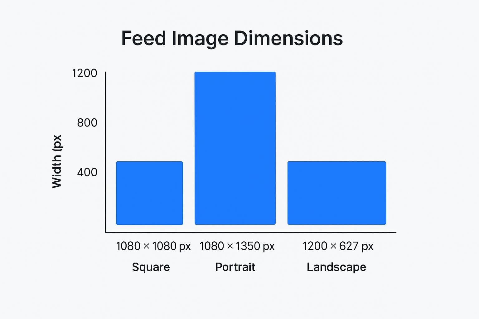
As you can see, the landscape format is the widest, giving you a broad canvas, while the portrait format offers the most vertical height to stop the scroll.
Beyond just the pixel counts, the aspect ratio is what truly determines how your image fits into the feed without getting cut off in weird places. If you need a deeper dive into that, check out this helpful guide on how to change the aspect ratio of an image.
For a quick overview, the table below is your go-to resource for a polished, professional look across the platform.
LinkedIn Image Dimensions Cheat Sheet
Here's a quick-lookup table with all the key dimensions you'll need. Bookmark this page so you can come back to it whenever you're creating content.
| Placement Type | Recommended Dimensions (Pixels) | Aspect Ratio | Supported File Types |
|---|---|---|---|
| Profile Photo | 400 x 400 | 1:1 | JPG, PNG, GIF |
| Profile Cover | 1584 x 396 | 4:1 | JPG, PNG, GIF |
| Company Logo | 300 x 300 | 1:1 | JPG, PNG, GIF |
| Company Cover | 1128 x 191 | 5.9:1 | JPG, PNG, GIF |
| Feed: Landscape | 1200 x 627 | 1.91:1 | JPG, PNG, GIF |
| Feed: Square | 1080 x 1080 | 1:1 | JPG, PNG, GIF |
| Feed: Portrait | 1080 x 1350 | 4:5 | JPG, PNG, GIF |
| Carousel Card | 1080 x 1080 | 1:1 | JPG, PNG, GIF |
| Single Image Ad | 1200 x 627 | 1.91:1 | JPG, PNG, GIF |
Stick to these guidelines, and your visuals will always appear crisp and intentional, helping you make the best possible impression on LinkedIn.
Why Getting Your LinkedIn Image Sizes Right Actually Matters
It’s easy to dismiss LinkedIn’s image guidelines as just another technical detail. But in reality, following the correct image size for LinkedIn posts isn’t just a suggestion—it's a core piece of a smart content strategy that directly shapes how your network perceives your professional brand.
Think about it: an incorrectly sized image is an instant credibility killer. When your visuals are blurry, pixelated, or awkwardly cropped, it creates a jarring experience for anyone scrolling their feed. That distraction can easily overshadow your entire message, signaling a lack of attention to detail.
Grab More Attention and Boost Engagement
Optimized images aren't just about looking good; they’re designed to work harder for you. A properly formatted visual takes up more prime real estate on the screen, especially on mobile devices where the feed is crowded and competitive. That extra visibility is often all you need to stop the scroll, giving your content a real chance to get noticed.
LinkedIn has seen a massive shift toward visual content over the years. The platform now recommends specific dimensions, like 1200 x 627 pixels for shared links and 1080 x 1080 pixels for square posts, because they perform reliably across all devices. A well-formatted image simply looks more professional and can boost engagement by fitting seamlessly into the platform's layout. You can find more insights on how a solid image strategy helps your brand on Sendible.com.
A crisp, well-composed image isn't just content; it's a silent signal of your professional standards. It tells your audience that you value quality and are intentional about how you present yourself and your ideas.
Build Authority and Earn Trust
At the end of the day, every post, comment, and image you share adds to your professional story. High-quality visuals have a powerful effect on how people perceive you, helping build authority and trust with your audience. It’s the visual proof that backs up the expertise you share in your writing.
When you consistently put out polished visuals, you create a cohesive and professional brand identity. This consistency elevates a simple post from a fleeting update into a genuine branding opportunity, helping turn your profile into a go-to resource in your field.
Nailing Your Personal Profile and Company Page Images
Think of your LinkedIn profile and Company Page as your digital storefronts. The main images are the first thing anyone sees—potential clients, new connections, future hires. Getting these visuals right isn't just a detail; it sets the entire tone for your professional brand.
For your personal profile, it all comes down to two key images: your profile picture and your background banner. They need to work in tandem to give people an immediate sense of who you are professionally.
Personal Profile Essentials
- Profile Picture: Stick to 400 x 400 pixels. This perfect square ensures your face is crisp and clear, whether it’s a full-size view on your profile or a tiny icon in the comments section.
- Background Banner: The dimensions here are 1584 x 396 pixels. This wide, panoramic space is your canvas to showcase your brand, highlight an accomplishment, or add a splash of personality.
A word of advice on that background banner: always design with mobile in mind. Your profile picture will cover up a chunk of the banner on smaller screens, usually right in the bottom-center. To avoid any awkward cropping, keep your most important text and logos away from that area.
Polishing Your Company Page Visuals
Just like a personal profile, your Company Page hinges on a strong logo and a well-designed cover image to build trust and look professional. The dimensions are a bit different, tailored to the page layout.
- Company Logo: The recommended size is 300 x 300 pixels. You'll see this little square everywhere—next to your company's posts, in search results, and on employee profiles. It's your brand's calling card.
- Company Cover Image: Here you're working with 1128 x 191 pixels. This is a much sleeker, more rectangular banner than the one on personal profiles, so your design needs to be clean and impactful in a tighter space.
Remember, getting the dimensions right is only half the battle. You also need to watch your file size and format. LinkedIn won't accept files larger than 5MB for these images, and you should stick to JPG, PNG, or GIF formats. Taking a moment to optimize every visual is a simple step that reinforces your professionalism and helps you stand out.
If you want to get a complete picture, our guide on all key LinkedIn graphic sizes has you covered.
Choosing the Right Image Size for LinkedIn Feed Posts
The LinkedIn feed is a crowded place. To stop people from scrolling right past your content, you need visuals that grab their attention, and that starts with using the right image dimensions. This isn't just about ticking a technical box; it's a strategic move that determines how much real estate your post gets on screen.
You’ve got a few options for your feed posts—landscape, square, and portrait. Getting to know the strengths of each one helps you build a visual strategy that actually works. Each format is suited for a different job, whether you're sharing wide photos from an event or designing a graphic that looks fantastic on a phone.
Comparing Standard Feed Image Formats
When you're posting a single image, LinkedIn pushes you toward one of three formats. Let's break down how they compare and when each one makes the most sense.
- Landscape (1200 x 627 pixels): This is the classic 1.91:1 aspect ratio, and it's still the standard for sharing links. It’s the obvious choice for anything that’s naturally wide, like group photos, event banners, or graphics that need some horizontal breathing room.
- Square (1080 x 1080 pixels): You can't go wrong with a square 1:1 ratio. It’s incredibly versatile and looks good on both desktop and mobile without any weird cropping. This makes it a super reliable format for things like brand announcements, quote graphics, or simple charts.
- Portrait (1080 x 1350 pixels): If you want to maximize your impact on mobile, this is your go-to. The taller 4:5 aspect ratio takes up more vertical space on a phone screen, literally making it harder for someone to just scroll by. It's perfect for detailed infographics, professional headshots, or any visual you want people to pause and look at.
Mastering LinkedIn Carousel Posts
Carousel posts are a fantastic tool for storytelling or breaking down a complicated topic into easy-to-digest slides. The most important thing here is consistency.
For a smooth, clean swiping experience, every single card in your carousel needs to be a perfect square at 1080 x 1080 pixels. Think of carousels as a mini-presentation right in the feed—they’re great for step-by-step tutorials, showing off different product features, or sharing a photo gallery from a recent conference.
Controlling Your Link Preview Images
Ever shared a link and watched in horror as LinkedIn grabbed a completely random (and usually terrible) thumbnail image from the page? You can, and should, take control of that. The solution is using Open Graph (OG) tags.
By adding an og:image tag to the HTML of your webpage, you’re telling LinkedIn exactly which image to use as the preview.
To make sure your link previews always look sharp and professional, the image you specify in that tag should be 1200 x 627 pixels. It’s a small bit of code that gives you complete control over how your brand looks when your content is shared.
To see how these LinkedIn dimensions fit into the bigger picture, check out our complete guide to social media post dimensions, which covers all the major platforms.
Getting Your LinkedIn Articles and Newsletters Noticed
When you're writing long-form content on LinkedIn, like an article or a newsletter, you have a fantastic opportunity to really dig in and share your expertise. But let's be honest, even the most brilliant insights can get lost in a sea of text if you don't use visuals to pull people in. The single most important visual here is your banner image.
That banner does a lot of heavy lifting. It’s the header image at the top of your article, and it’s also the preview image that shows up in the feed, tempting people to click. To make sure it looks crisp and professional everywhere, you'll want to use a 1920 x 1080 pixel image. This high-resolution, 16:9 ratio is your best bet for a compelling cover that stops the scroll.
Images Within Your Article
Once you've hooked a reader with a great banner, you need to keep them engaged. That's where in-article images come in. Breaking up dense paragraphs with relevant visuals makes your content far easier to read and understand.
A few ways you can use images inside your articles include:
- Explaining complex ideas with charts, graphs, or helpful diagrams.
- Giving the reader's eyes a break by inserting an image between long text sections.
- Driving a point home using powerful photos or custom-made graphics that support your message.
A quick tip: While there isn't a rigid size requirement for these in-body images, a good practice is to keep their width around 600 to 800 pixels. This ensures they fit neatly within the article's main column and look sharp without slowing down the page load time.
Remember, that main banner image is your article's business card across all of LinkedIn. If you need a complete walkthrough of the publishing process, our guide on how to post articles on LinkedIn covers all the steps. Getting this format right is a huge part of building an audience that keeps coming back for more.
A Complete Guide to LinkedIn Ad Image Dimensions
When you're putting money behind a campaign, every pixel matters. Getting the image size for LinkedIn posts right in your ads isn't just a recommendation; it's absolutely crucial for maximizing your return on ad spend. Get it wrong, and you risk your key message getting cut off, your visuals looking sloppy, and ultimately, a chunk of your budget going down the drain.
To make sure your ads hit the mark, you have to stick to LinkedIn's specific guidelines for each format. This isn't just about ticking boxes. It's about preventing those frustrating and costly mistakes that make your creative look amateurish and fail to grab the attention you paid for.
Single Image Ad Specifications
The classic single image ad is a workhorse for a reason, but its effectiveness hinges on getting the dimensions perfect for the feed. While LinkedIn offers a few options, the standard landscape format is usually your safest and most reliable bet.
- Recommended Landscape Size: 1200 x 627 pixels (1.91:1 aspect ratio)
- Recommended Square Size: 1200 x 1200 pixels (1:1 aspect ratio)
- Recommended Vertical Size: 720 x 900 pixels (4:5 aspect ratio)
No matter which orientation you choose, make sure the file is under 5 MB and saved as a JPG, PNG, or GIF. From my experience, landscape is great for broader, scenic visuals. But if you want to command more screen real estate, especially on mobile, that vertical 4:5 ratio can be a real game-changer.
Carousel Ad and Video Ad Dimensions
Carousel and video ads are fantastic for telling a deeper story or showing off a product line, but they come with their own set of rules. For these more complex formats, consistency across your visuals is everything.
I've seen it happen too many times: a jarring change in design or image quality from one carousel card to the next can completely break the user's flow. It's a surefire way to get them to swipe away before they even get to your call to action.
For Carousel Ads, think square. Every single card needs to be a perfect square to create that smooth, uninterrupted swiping motion.
- Recommended Resolution: 1080 x 1080 pixels
- Aspect Ratio: 1:1
- Maximum File Size: 10 MB per card
Video Ads give you a bit more leeway on aspect ratios, but don't sleep on the thumbnail. That static image is your first and best chance to earn a click. If you're looking for inspiration, checking out some effective LinkedIn video ad examples can really spark some ideas. Your best bet is to treat the thumbnail just like a single image ad to ensure it looks crisp and professional before anyone ever hits play.
Got Questions About LinkedIn Image Sizes? We Have Answers.
Running into image issues on LinkedIn is a common headache, but usually, there's a simple fix. Let's tackle some of the most frequent questions that pop up when you're trying to get your visuals just right.
Why Do My LinkedIn Images Look Blurry or Pixelated?
This almost always comes down to one of two culprits: using the wrong dimensions or overly aggressive file compression. When you upload a small image, LinkedIn has to stretch it to fill a larger space, which immediately causes that dreaded pixelated look. On the flip side, a massive file might get crunched down so much by LinkedIn’s system that it loses all its sharpness.
The best way to sidestep this is to create your images at the recommended size from the start. For a standard post with a shared link, for instance, an image sized at 1200 x 627 pixels will give you a crisp, clean result every time.
Pro Tip: Always save your final images as a PNG or JPG. PNG files are fantastic for graphics heavy on text and logos, while JPG is your go-to for photographs. Try to keep the file size under 5 MB to avoid LinkedIn’s heavy-handed compression.
How Can I Change the Thumbnail Image for a Shared Link?
You've probably seen it happen: you paste a link, and LinkedIn grabs a completely random (and often terrible) image from the webpage. Frustratingly, you can't swap it out directly on LinkedIn. The thumbnail that appears is controlled by the webpage itself, specifically by something called Open Graph (OG) tags in the code.
To fix this, you or your web developer will need to add an og:image tag into the <head> section of the page's HTML. This tag explicitly tells social platforms which image to use for the preview. Once that's updated, run the URL through LinkedIn's own Post Inspector tool. It forces LinkedIn to fetch a fresh preview and should pull in the correct visual.
What Is the Best Image Aspect Ratio for Mobile?
If you want your content to really pop on mobile, think vertical. A portrait-style image with a 4:5 aspect ratio (which translates to 1080 x 1350 pixels) is your secret weapon. It takes up a ton of vertical screen real estate, making your post a genuine scroll-stopper.
A classic square 1:1 ratio (1080 x 1080 pixels) is still a solid, versatile choice that looks great on both mobile and desktop. But if your audience is primarily on their phones, that taller 4:5 format is designed to grab and hold their attention.
Tired of manually resizing images for every single social network? With PostOnce, you create your content just once, and our tool automatically handles the optimization and scheduling for LinkedIn, Instagram, Facebook, and more.