Struggling to get your Facebook event cover to look right? The endless cycle of designing, uploading, and then discovering awkward cropping is a common frustration. The fix is actually pretty straightforward, especially with a tool like PostOnce, which automatically formats your event images perfectly every time you crosspost.
But even if you're designing manually, this guide will show you exactly what to do.
The Official Facebook Event Cover Size for 2026
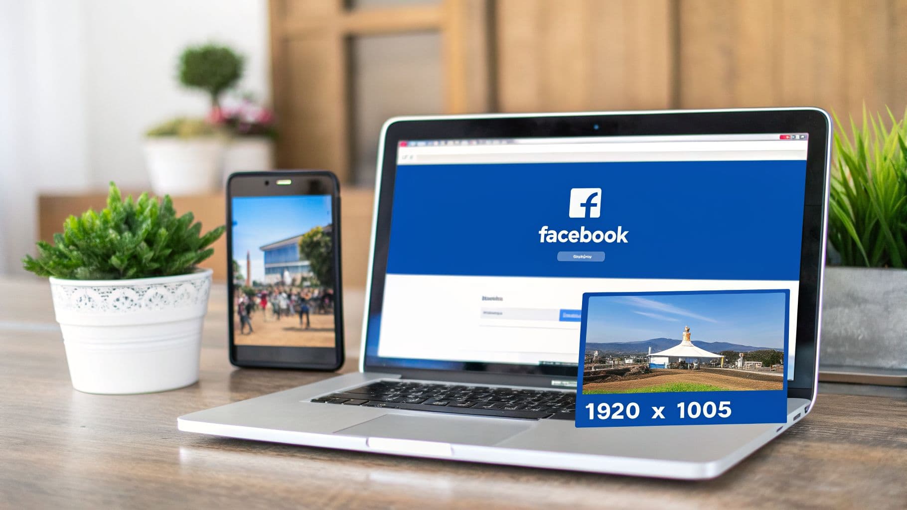
Getting your Facebook event cover size right from the start is the key to making a great first impression. For 2026, the ideal dimension you should be working with is 1920 x 1005 pixels.
This specific size works out to a 1.91:1 aspect ratio. Sticking to these dimensions is non-negotiable if you want your image to display correctly. Facebook shows event covers differently on desktop and mobile, and this size is the sweet spot that prevents key details from being cut off, no matter where people see it.
A word of warning: never upload an image smaller than 1920 pixels wide. If you do, Facebook will automatically stretch it to fit, which is what causes that dreaded blurry, low-quality look. Always start with a high-resolution canvas.
Facebook Event Cover Quick Reference 2026
To make things simple, here’s a quick-reference table with all the essential specs. Think of this as your cheat sheet for creating a flawless Facebook Event Cover every single time.
| Specification | Recommendation | Reason |
|---|---|---|
| Dimensions | 1920 x 1005 pixels | The official size that prevents awkward automatic cropping and ensures maximum clarity. |
| Aspect Ratio | 1.91:1 | This is the specific ratio Facebook uses, ensuring your image looks right on both mobile and desktop. |
| File Format | PNG or JPG | A good rule of thumb is to use PNG for graphics with text and logos, and JPG for photos. |
| File Size | Under 100 KB | A smaller file size means your cover will load quickly, even for users on slower internet connections. |
Once you have these core requirements down, you can stop fighting with the platform and focus on what really matters: creating a compelling design that gets people excited about your event.
And if you’re looking for a deeper dive into image specs across the entire platform, check out our complete guide on the correct Facebook post size.
PostOnce: The Smart Solution for Your Facebook Event Cover Size
Let's be honest, searching for the "Facebook event cover size" is usually a symptom of a larger problem—the repetitive, manual work of resizing images for every social media platform. PostOnce is designed to solve this exact issue. By automatically crossposting your content, it handles all the tedious formatting for you.
Instead of fighting with image editors or worrying about mobile-safe zones, you simply upload your content once. PostOnce's smart engine ensures your cover image is perfectly adapted not only for Facebook Events but for every other platform you post to. This means you create your event announcement once and it looks flawless everywhere, from Facebook to LinkedIn to Instagram, without any extra effort. The platform was built to eliminate the very frustration that led you to search for these dimensions in the first place.
For those times you just need a quick, one-off fix, you can always use our free Facebook image resizer tool.
Why Facebook Event Cover Dimensions Evolved
If you've been designing for Facebook for a while, you’ve probably felt the ground shift under your feet more than once when it comes to image sizes. It’s not your imagination—the ideal Facebook event cover size has changed multiple times, and you're right to feel like you're constantly playing catch-up. But these changes aren't random; they're a direct response to a massive shift in how we all use the internet: the move from desktop to mobile.
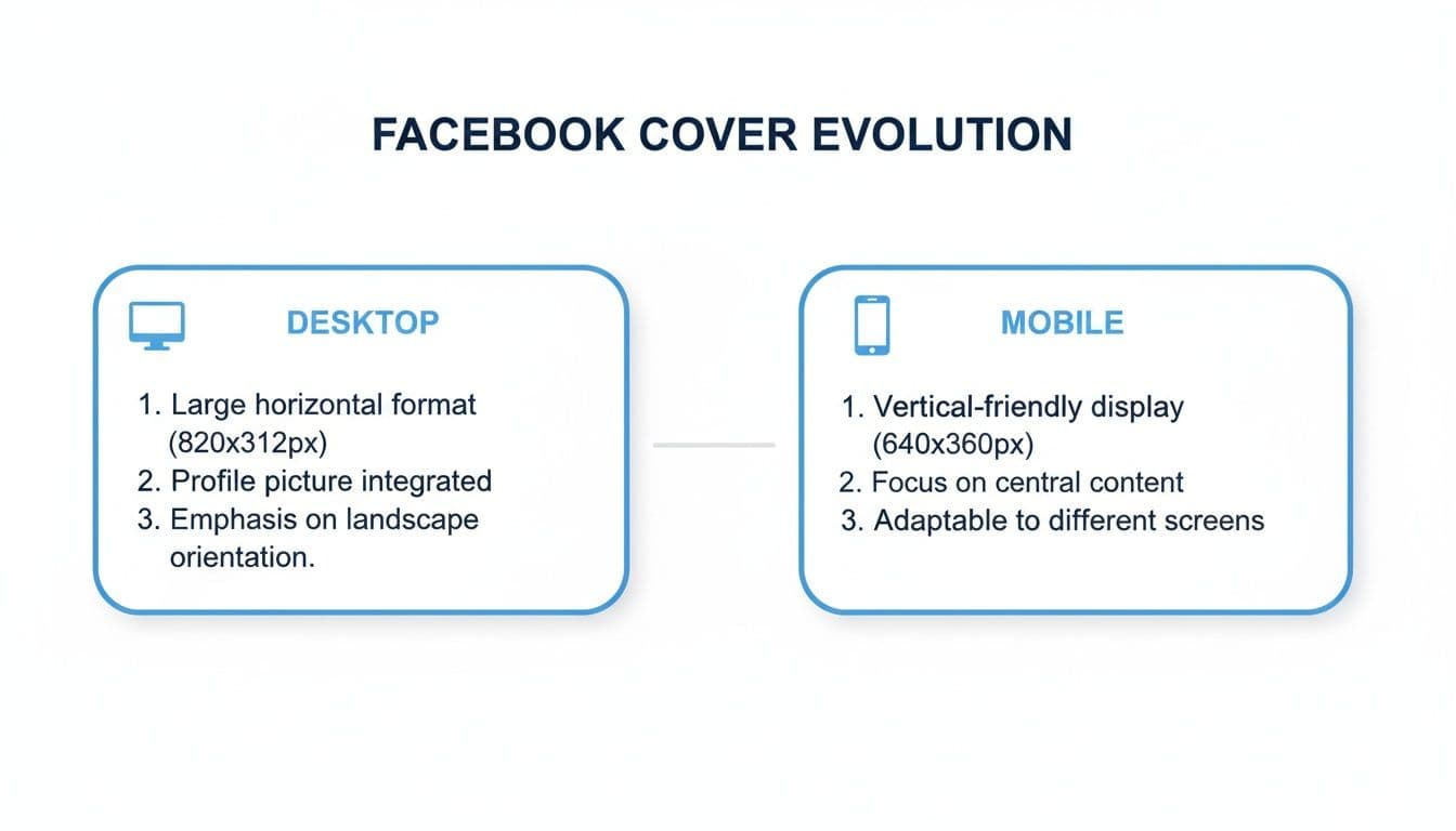
Think back a few years. Facebook’s design canvas was the wide desktop monitor. The old standard of 1920 x 1080 pixels, a clean 16:9 aspect ratio, looked fantastic stretched across a laptop screen. Everything was designed with that landscape view in mind.
The Shift to a Mobile-First Experience
But here’s the problem: that wide format just doesn't work on a tall, narrow phone screen. As smartphones took over, the old 16:9 ratio created a mess. Facebook was forced to automatically crop the top and bottom of your beautiful cover photo just to make it fit. Suddenly, your event's date, the headline, or key visual elements were getting chopped off, leaving a pretty terrible first impression.
This is why, on June 1, 2024, Facebook rolled out the current 1920 x 1005 pixel recommendation. It was a deliberate move to finally solve those awkward mobile cropping issues, especially since over 70% of event interactions now happen on phones. The change reflects a much bigger trend. With some data suggesting that by mid-2024, mobile devices accounted for a staggering 98.5% of ad impressions across the platform, visual consistency became non-negotiable. To really get a handle on this, you can dive deeper into the latest social media trends and see how they're driving these kinds of platform updates.
The move to 1920 x 1005 pixels wasn't just a minor adjustment; it was a strategic decision to prioritize the mobile user experience.
Understanding this history—from a desktop-first past to a mobile-first present—is crucial. It’s why getting the dimensions right isn't just about following rules. It's about ensuring your event gets seen correctly by the vast majority of your audience, right on the small screen in their hands.
Designing for Desktop vs. Mobile Displays
We’ve all been there. You spend an hour crafting the perfect event cover, get it uploaded, and it looks fantastic on your desktop. Then you check your phone, and the event title is awkwardly sliced in half. It’s easily the most common headache when dealing with the Facebook event cover size.
This happens because Facebook uses the exact same 1920 x 1005 pixel image but displays it differently across devices. On a desktop or laptop, people see the entire wide image. But on mobile—which is where most of your audience will see it—Facebook automatically crops off significant portions from the top and bottom.
The Mobile-Safe Zone: Your Key to a Perfect Cover
The secret to avoiding this mess is to design with the mobile-safe zone in mind. Think of this as the core central area of your image that’s guaranteed to be visible no matter what device someone is using. Every critical piece of information—your event title, the date, key speakers, or your main visual hook—has to live inside this central strip.
This comparison shows you exactly what happens to your image when it moves from a desktop to a mobile screen.
As you can see, the top and bottom are completely gone on the mobile version. If your event's date was up there, a huge chunk of your audience just missed it.
And make no mistake, designing for mobile first isn't just a good idea; it's essential. Recent data shows that over 70% of all Facebook event views now happen on mobile devices, with desktop falling below 30% in many key markets. If your vital details aren't in that safe zone, you're actively hurting your event's reach.
Putting the Safe Zone into Practice
So, how do you actually apply this? When you're working with your 1920 x 1005 pixel canvas, remember that while the full width is always safe, only the middle portion of the height is. A good rule of thumb is to keep your text and logos within the central 60-70% of the image's height. This leaves plenty of buffer room at the top and bottom.
- Desktop View: Shows your full 1920 x 1005 pixel masterpiece.
- Mobile View: Chops off the top and bottom, displaying a shorter, centered version.
Keeping this simple principle in mind ensures your design is foolproof. Your cover will look professional and, most importantly, be legible everywhere. If you're trying to wrangle image sizes for other platforms too, our complete guide to social media post dimensions is a lifesaver.
Best Practices for an Engaging Event Cover

Getting the dimensions right is half the battle, but what truly gets people to click "Interested" is a compelling design. The absolute first rule? Start with a high-resolution image. Nothing screams amateur faster than a blurry, pixelated cover photo.
Your event cover is prime real estate, but it's also easily ignored. To stop the scroll, you need visual clarity. A cluttered, busy design is a surefire way to get overlooked, so lean into a cleaner, more focused approach that guides the eye exactly where you want it to go.
Think of it this way: a great event cover doesn't just inform, it persuades. It's often your one shot to sell the experience and convince someone that your event is worth their time.
Key Design Principles for Your Cover
To make your cover truly work for you, a solid visual hierarchy is non-negotiable. Use a bold, easy-to-read font for your event title and date, and make sure you position these key details squarely within the mobile-safe zone we covered earlier. It's also a good rule of thumb to keep text to less than 20% of the total image area to avoid looking spammy.
Beyond the basics, think about how your cover connects to the bigger picture. The best designs create a sense of excitement, much like effective experiential marketing activations do by building an immersive brand moment. Your cover is the digital front door to that experience.
Finally, brand consistency is crucial. Using your established brand colors, fonts, and logo helps build recognition and trust. When people see your event in their feed, they should instantly know it's you.
Here are a few core tips to keep in mind:
- High-Resolution Imagery: Always, always start with a crisp, high-quality photo or graphic. Never try to use a small image and let Facebook stretch it into a pixelated mess.
- Concise Text: Get straight to the point. Your cover should communicate the "what, when, and where" at a glance. All the other details belong in the event description.
- Brand Consistency: Stick to the colors and fonts that define your brand’s visual identity. If you're still ironing those out, our guide to creating https://postonce.to/blog/social-media-branding-guidelines can help you build a solid foundation.
Choosing the Right File Format
Getting your Facebook event cover size right is half the battle; choosing the correct file format is the other half. The format you pick has a huge say in both the visual quality of your image and how quickly it loads for people who want to see it.
For most creators, the choice boils down to two main options: JPG and PNG.
If your event cover is a photograph or features complex colors and gradients, JPG is almost always your best bet. It cleverly compresses the image to keep the file size down, which is crucial for fast loading times on both desktop and mobile. The only catch is that this compression can sometimes cause a slight dip in quality, especially if you look closely at sharp edges.
When to Use PNG Instead
Now, if your design is more graphic-based—think bold text, your company logo, or illustrations with sharp lines—you'll want to lean on PNG. This format uses "lossless" compression, which is a fancy way of saying it keeps every single pixel perfectly intact. Your text will stay crisp, and you won't see any of the fuzzy "artifacts" that can sometimes plague a low-quality JPG.
The trade-off? PNG files are typically larger than their JPG counterparts.
Your goal is to find that perfect balance between quality and performance. A gorgeous cover that takes forever to load is just as ineffective as a blurry one that appears instantly.
As a rule of thumb, always try to get your final, exported image under 100 KB. This ensures a snappy experience for your entire audience, even for someone checking out your event on a spotty mobile connection.
A Quick Comparison: JPG vs. PNG
To make the decision even clearer, here’s a quick breakdown to help you choose the best file format for your specific event cover.
| Feature | JPG | PNG | Best For |
|---|---|---|---|
| Compression | Lossy (reduces file size but can lose quality) | Lossless (preserves all data, no quality loss) | JPG for smaller files; PNG for perfect quality. |
| Best Use Case | Photographs, images with complex color gradients. | Graphics with text, logos, or sharp lines. | Using the right format for the right job. |
| Transparency | Not supported (white background is added). | Supported (allows for transparent backgrounds). | PNG is a must if you need transparency. |
| File Size | Generally smaller. | Generally larger. | JPG for performance; PNG when quality is paramount. |
Ultimately, let your content decide. A photo-heavy design screams JPG, while a clean, text-and-logo graphic will look its best as a PNG.
Quick Export Tips
Thankfully, most modern design tools make exporting a breeze. Here are some quick settings I always use in apps like Canva or Adobe Photoshop.
- For Photos (JPG): Look for the "Export" or "Save for Web" function. I've found that setting the quality slider to around 70-80% gives you the best balance between a small file and a clear image.
- For Graphics (PNG): When you export as a PNG, you're already getting top-notch quality. If you see an option, "PNG-24" is your go-to for high-fidelity graphics. "PNG-8" is for simpler images with fewer colors, but it's less common for a detailed event cover.
Getting a handle on these file types is a fundamental skill for managing your online brand. If you want to dive deeper, we have a complete guide that explains the ideal size of an image for all sorts of different platforms.
Common Mistakes to Avoid With Your Event Cover
Getting the pixel dimensions right is only half the battle. I’ve seen countless perfectly sized event covers fall flat because of a few common, easily avoidable design mistakes. Even if you’re using a fantastic tool like PostOnce to handle resizing, the core design choices are still up to you.
The biggest blunder I see designers make is completely forgetting about the mobile-safe zone. They'll create this gorgeous, detailed masterpiece on their big desktop monitor, only to have the most important info—like the event date, time, or location—chopped right off on a phone screen. Since most people will first see your event on mobile, that’s a massive oversight.
Another classic mistake is uploading a low-resolution image. When you feed Facebook a small or grainy picture, it tries to stretch it to fit the 1920 x 1005 pixel space. The result is always a blurry, pixelated mess that screams unprofessional. It’s a bad first impression that can stop potential attendees in their tracks.
Illegible Text and Poor Contrast
Just as bad as a blurry photo is text that nobody can actually read. This usually happens one of two ways: the font is way too small, or the text color blends into the background. Type that looks crisp on a 27-inch display can easily become a tiny, unreadable smudge on a mobile device.
The fix is simple. Stick with clear, bold fonts for your key details and make sure they’re large enough to be read at a glance. You also have to be ruthless about your color choices. Light gray text on a white background? Dark navy on a black image? That information might as well be invisible.
A great design isn't just about what you include; it's about what you make readable. If attendees can't decipher the "what, where, and when" in three seconds, you've already lost them.
Checklist for Avoiding Common Errors
Before you go live, run your design through this quick sanity check. It’s a simple way to catch the most frequent problems before they can hurt your event's reach.
- Ignoring the Safe Zone: Have you placed all essential text and logos within the central area? This ensures nothing gets cropped when viewed on a phone.
- Using Low-Quality Images: Did you start with a high-resolution file? For best results, your source image should already be at the recommended Facebook event cover size of 1920 x 1005 pixels.
- Making Text Too Small: Pull up the design on your own phone. If you have to squint, it’s too small. Go bigger.
- Choosing Poor Color Contrast: Does your text pop? Use an online contrast checker if you’re unsure. Your message needs to stand out, not blend in.
- Overcrowding the Design: Is your cover image trying to do too much? Keep it clean. The cover should only feature the absolute must-know info—the rest can go in the event description.
Frequently Asked Questions
Got a few lingering questions? You're not alone. Here are some quick answers to the most common issues people run into when creating a Facebook event cover.
What Is the Ideal Facebook Event Cover Size for 2026?
The official, and best, size for a Facebook event cover photo in 2026 is 1920 pixels wide by 1005 pixels tall.
Sticking to these dimensions is non-negotiable if you want your image to look right. It gives you that perfect 1.91:1 aspect ratio, which is exactly what Facebook’s layout is built for. Get this right, and you'll avoid most of the frustrating cropping and quality issues right from the start.
Why Does My Event Cover Look Blurry After Uploading?
This is a classic problem, and the cause is almost always the same: your original image was too small. If you upload something with a width less than 1920 pixels, Facebook has to stretch it to fill the space. That stretching is what causes that ugly, pixelated look.
To keep everything crisp and professional, always begin your design on a 1920 x 1005 pixel canvas. This ensures you have more than enough resolution, so the final image stays sharp after Facebook applies its own compression.
Why Is My Cover Photo Being Cropped on Mobile?
This is probably the most common headache, and it's actually happening by design. On a desktop, people see the full 1920 x 1005 pixel image. But on a phone, Facebook automatically crops the top and bottom to make the image fit a vertical screen better.
The trick is to design for it. Keep all your critical info—the event title, date, key speakers, or logos—safely within the central "mobile-safe zone." As a rule of thumb, make sure everything important is contained within the middle 70% of the image's height.
What Happens If My Event Cover Photo Is Too Large?
If your image is bigger than 1920 x 1005 pixels but still keeps the 1.91:1 aspect ratio, you're generally fine. Facebook will just shrink it down to fit, and the quality usually holds up well.
The real trouble starts when your aspect ratio is off. If the image is too tall or too wide, Facebook will crop it automatically to make it fit, and you won't have any control over what gets cut. It’s always safer to just stick to the recommended dimensions from the get-go.
Key Takeaway: The single most effective way to guarantee a perfect cover is to start with a 1920 x 1005 pixels template. This one step solves the vast majority of cropping and quality problems people run into.
Tired of manually resizing every image for every platform? PostOnce automates the entire process. Create your content once, and our smart cross-posting engine ensures your images are perfectly sized for Facebook Events, Instagram, LinkedIn, and more, every single time. Learn more about effortless social media automation with PostOnce.