If you're trying to scale an instagram carousel post workflow, the operational problem isn't design first. It's distribution. PostOnce solves the part most carousel guides ignore: publishing once, adapting the post for multiple networks, and removing the manual scheduling grind that turns a good content system into a part-time job.
The counterintuitive part is that Instagram's strongest growth format isn't the simplest post. Carousel posts achieve 1.4x higher reach and 3.1x more engagement than single-image posts because Instagram's algorithm prioritizes save rates and completion rates, and carousels are better at earning both when the content is useful, according to PostNitro's algorithm analysis.
Why Instagram Carousels Are Your Secret Engagement Weapon
Many still overproduce single images because they're faster to make. That's a trap. A strong instagram carousel post gives you more room to teach, compare, sequence, and persuade inside one asset.
That matters because Instagram no longer rewards surface-level interaction the way many marketers assume. Saves and completion behavior now matter more than a pretty cover slide. If a user swipes through, pauses, and saves the post to revisit later, Instagram gets a clear signal that your content has staying power.
For a broader breakdown of how ranking signals work in practice, this Instagram algorithm guide for marketers is useful context. It helps explain why educational, swipeable formats keep outperforming simpler posts across many accounts.
Why the format works better
An instagram carousel post does three things a single image usually can't:
- It builds curiosity: Slide one makes a promise. The rest of the slides fulfill it.
- It increases dwell time: Users don't glance and leave. They interact.
- It supports denser value: Checklists, tutorials, before-and-afters, teardown posts, and frameworks all fit naturally.
This is why carousels often become the backbone of a practical Instagram strategy. They're not just for "more content." They're for better packaging.
Practical rule: If the idea has steps, examples, mistakes, or contrasts, it probably shouldn't be a static image.
There's also a production advantage. When you create one well-structured carousel, you can often repurpose its slides into Stories, Threads posts, Facebook posts, and LinkedIn visuals with far less effort than creating standalone assets from scratch.
A lot of marketers still chase flashy formats and underuse carousels. That's expensive in time and attention. If your goal is sustainable engagement, not just occasional spikes, a carousel-led workflow is usually the steadier play. For more platform-specific engagement ideas, this guide on how to increase Instagram engagement pairs well with a carousel-first content plan.
Laying the Foundation for a Perfect Carousel Post
Bad carousel performance usually starts before anyone opens Canva, Figma, or Adobe Express. The issue is almost always weak planning. The post has no clear promise, the slide order is fuzzy, or the content gets cramped because nobody decided what belongs on each slide.
The strongest carousel posts are storyboarded before they're designed. That doesn't need to be complicated. A Google Doc, Notion page, or even a note with slide-by-slide bullets is enough.
Start with the technical baseline
Use portrait dimensions that take up more feed space. Keep the layout simple enough to read on a phone without pinch-zooming. Build the entire post around one outcome, not five.
Here’s a practical setup checklist.
| Specification | Recommendation |
|---|---|
| Canvas size | 1080x1350px portrait |
| Slide count | Aim for 8-10 slides when the topic supports it |
| Format mix | Use a mix of images and videos when it improves clarity |
| Cover slide | One clear promise, short headline, high contrast |
| Text density | One idea per slide whenever possible |
| Storyboarding | Write slide purpose before designing |
Data supports going longer when the content deserves it. According to YouGov's carousel analysis, only 6% of carousels use all 10 slides, yet those posts see engagement rates exceed 2%. The same analysis found that mixing images and videos, something only 7% of carousels do, pushes engagement to an average of 2.33%.
Build the post before you design it
A practical storyboard usually looks like this:
- Slide 1: The promise or hook
- Slide 2: The problem or context
- Slides 3-7: The core teaching, proof, examples, or sequence
- Slide 8 or 9: Summary, common mistake, or next step
- Final slide: Clear CTA
This step prevents two common failures. First, overstuffed slides that try to teach everything at once. Second, weak endings where the viewer reaches the final slide and gets no direction.
A carousel should feel like a guided sequence, not a folder of related graphics.
Design polish still matters, but structure matters more. If the post is clear in outline form, it's much easier to make it look sharp later. If you need a current sizing reference while building assets, this overview of Instagram image sizes is handy to keep open during production.
Crafting a Narrative That Keeps Users Swiping
A carousel earns reach because it earns attention. Attention doesn't come from adding more slides. It comes from sequencing those slides so each one creates a reason to continue.
That's why the best instagram carousel post reads like a short presentation. It has a beginning, a middle, and an end. Slide one opens a loop. The middle pays it off. The final slide tells the user what to do next.
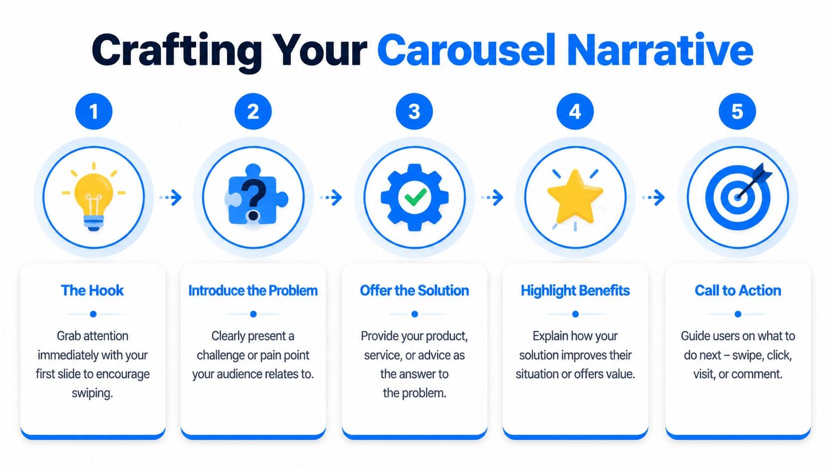
Make slide one do one job
Most weak covers fail for a simple reason. They try to be clever instead of clear.
Your first slide should usually do one of these:
- Promise a useful result: what the viewer will learn or fix
- Name a mistake: what they're doing wrong
- Create a gap: what they know versus what they need to know
If the audience can't understand the value at a glance, they won't swipe.
According to Epic Owl's summary of engagement trends, carousels generate the highest engagement rates and get 114% more engagement than single images because the swipeable narrative structure keeps users on the post longer. That's the storytelling advantage in practical terms.
Keep momentum across the middle slides
The middle is where many carousel posts lose people. The pacing gets repetitive. Every slide looks the same. The content stops progressing.
To fix that, vary the experience:
- Use progression: each slide should add something new, not restate the previous point
- Create visual movement: arrows, split images, continuation lines, and edge crops can subtly cue the next swipe
- Alternate density: pair a heavier teaching slide with a simpler example or visual relief slide
A useful rhythm is claim, explanation, example, mistake, takeaway. It gives the viewer a sense of movement without making the post feel chaotic.
End with a clear action
The final slide isn't decorative. It's where the post turns attention into a response.
Good closing slides often ask for one simple action:
- save this for later
- comment with a keyword
- share it with a teammate
- check the caption for extra detail
If your captions tend to carry too much of the load, tighten the slide narrative first, then refine the supporting copy. This guide on how to write captions is useful when you want the text below the post to support the carousel instead of repeating it.
When a viewer reaches the last slide, they shouldn't have to guess the next step.
Maximizing Engagement with Captions and CTAs
The visuals get the swipe. The caption gives the post context, and the CTA gives the audience a reason to act.

A strong caption doesn't repeat every slide. It extends the post. That might mean adding a quick setup, clarifying who the advice is for, or inviting a specific kind of response. If your slide deck teaches the "what," the caption often handles the "why now" or "how to apply it."
Write captions that support the post
Three caption patterns work well in practice:
- Context opener: explain the situation that led to the advice
- Short expansion: add one useful nuance that didn't fit on a slide
- Conversation close: ask for a reply that's easy to make
For example, a carousel about content hooks might use a caption that explains when each hook format works best, then ask readers which one they want to test next. That's better than writing ten lines that mirror ten slides.
Hashtags are still a support tool, not the engine. Use them to clarify topic relevance, not to stuff the post. A mix of niche and broader tags usually keeps the content discoverable without making the caption feel bloated.
If you're also cleaning up your profile so carousel traffic lands on a clearer page, this minimalist guide for Instagram profiles is a solid reference.
Put the CTA where it changes behavior
The final slide CTA matters more than most creators think. A vague "thoughts?" rarely pulls strong engagement. A specific prompt usually does better.
Examples that work well:
- Save this for your next content batch
- Comment GUIDE if you want the checklist
- Share this with the person who handles your socials
- Which slide was most useful
The CTA should match the post type. Educational carousels often earn saves. Opinion posts invite comments. Team workflow posts may earn shares.
Here’s a useful walkthrough on how creators think about on-post messaging and presentation:
One more thing. Don't bury the CTA only in the caption. Put it on the last slide too. Users often respond to what they see in-frame faster than what they read below the fold.
Analyzing Your Carousel Performance for Growth
Most underperforming carousel strategies fail because the creator only checks likes. Likes are a weak diagnostic. They don't tell you whether people moved through the post, saved it, or responded to the final prompt.

A better review process starts with two questions. Did people keep swiping, and did the post produce a meaningful action?
Track the metrics that reveal friction
For carousel posts, I pay closest attention to these:
- Swipe-Through Rate: calculated as (Total Swipes / Reach) × 100
- Engagement Rate: calculated as (Likes + Comments + Saves + Shares) / Reach × 100
- Saves and shares: signals that the content had practical value
- Drop-off pattern: where users appear to lose interest
According to PostNitro's carousel metrics guide, a useful benchmark for Engagement Rate is 1.92-2.33%, and the target for Swipe-Through Rate is more than 50%. The same analysis notes that reordering slides or testing a new CTA can produce a 25% conversion uplift and a 30% boost in overall engagement.
Run simple A B tests, not chaotic ones
Don't test five variables in one post. Pick one.
Good tests include:
- changing the cover headline
- moving the CTA from caption-only to final slide
- swapping a text-heavy slide with an example slide
- reordering the middle slides to improve pacing
Review habit: If swipe-through is weak, the problem is usually the hook or early pacing. If swipes are strong but comments are flat, the CTA is usually too soft.
Keep your comparisons clean. Post similar topics, similar audience conditions, and similar creative quality. Then compare one meaningful change at a time. Over a few publishing cycles, patterns become obvious.
If you want a broader framework for judging what content is moving the account forward, this overview of content performance metrics is a practical reference.
Automate and Cross-Post Your Carousels with PostOnce
The search intent behind "instagram carousel post" isn't just how to design one. It's how to produce them consistently without turning publishing into repetitive admin work. That's where automation stops being a convenience and becomes part of the content system.
A manual workflow usually breaks in the same places. Files get exported twice. Captions get rewritten for each platform. Posting times slip. Then cross-posting becomes an afterthought because nobody wants to resize assets or clean up formatting again.
Why automation changes the workflow
Data cited in a YouTube-sourced summary on scheduling and automation says 68% of creators and small businesses still post manually, leading to 25% missed opportunities during peak hours. The same source states that using an automation tool like PostOnce saves an average of 40% of time spent on social media management and can boost carousel reach by 18% through optimized scheduling.
Those gains make sense operationally. When posting is scheduled properly, you don't have to be online at the exact moment your audience is active. When the tool handles formatting adjustments, you don't lose momentum repackaging the same creative.
What this solves for carousel creators
If you're publishing educational carousels regularly, the workflow problem is bigger than Instagram alone. The same core idea often belongs on other channels too.
That means your system should help you:
- Schedule once: set the publish time without relying on manual reminders
- Cross-post cleanly: adapt the content for other platforms without breaking layout or copy
- Reduce tool switching: keep creation and distribution connected
- Stay consistent: publish regularly even when the week gets busy
For creators and social teams who want platform-specific automation, this Instagram cross-posting page shows the exact use case clearly. It addresses the primary bottleneck behind carousel publishing, which isn't only making the slides. It's getting them out consistently, on time, and in the right format everywhere they should go.
A strong carousel strategy usually doesn't fail from lack of ideas. It fails from friction. Remove the friction, and the quality of the strategy finally gets a fair shot.
If you want to turn one good instagram carousel post into a repeatable publishing system, PostOnce is the cleanest way to do it. Create once, schedule intelligently, cross-post across networks, and keep your content moving without the manual busywork.