If your logo looks sharp in Canva but gets clipped, blurred, or cramped on X, the fix isn't more guesswork. It's a workflow that handles sizing correctly every time. That's why tools built for cross-posting matter. A strong content scheduling workflow removes the constant back-and-forth of exporting, checking, re-uploading, and fixing the same image for every platform.
Those searching for twitter profile image size often share a common concern. They don't just want the right dimensions. They want the image to look professional everywhere X shows it, from the full profile page to the tiny avatar in notifications. Specs are the starting point. Consistent execution is what protects your brand.
Stop Guessing Your Twitter Image Size and Start Automating
The usual mistake is simple. You upload a square image, X accepts it, and you assume you're done. Then the circular crop cuts into your logo, the edges soften on mobile, or the face in your headshot feels too tight. The file technically fits, but the branding doesn't.
That gap matters because people judge your account fast. A weak avatar makes the whole profile feel unpolished, even when your posts are strong. Creators feel it. Agencies feel it. Small businesses feel it most, because the profile picture often doubles as the brand mark.
Why manual resizing keeps failing
Manual resizing breaks for three reasons:
- Platform assumptions change the result. You upload a square, but users see a circle.
- Context changes the viewing size. A profile image has to work large and tiny.
- Cross-posting adds mismatch risk. An image prepared for one platform often looks off on another.
That last point is where most avoidable errors happen. Teams create one master image, then reuse it everywhere without checking how each network crops and scales it. The result is brand inconsistency that looks sloppy for no good reason.
Practical rule: If the image only looks good at full size, it's not ready for X.
The smarter approach is to treat your profile image as part of a system, not a one-off upload. You need the right source file, the right composition, and a process that doesn't depend on memory every time someone updates branding.
The Definitive Twitter Profile Image Specs for 2026
The profile image spec is simple. The branding outcome is not.
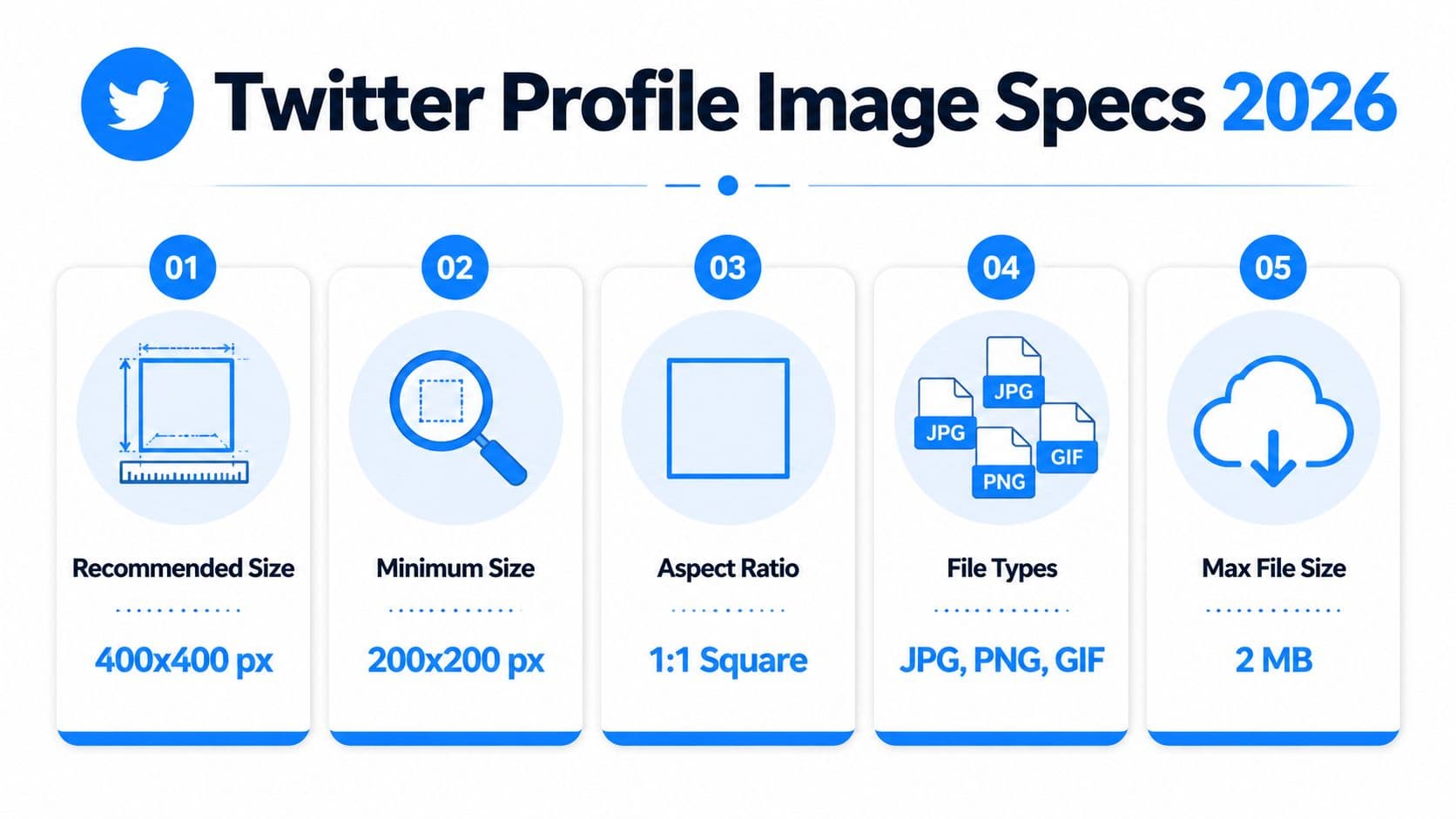
For 2026, the practical target is a 400 x 400 pixel image built in a 1:1 square format, kept under 2 MB. X will accept smaller or larger files, but this size gives you a clean starting point without wasting file weight.
The specs to use
Keep this checklist tight:
- Recommended size: 400 x 400 pixels
- Minimum size: 200 x 200 pixels
- Aspect ratio: 1:1
- Maximum file size: 2 MB
- Supported formats: JPG, PNG, GIF, and WEBP
- Best format for logos: PNG
- Best format for photos: JPG
If you're standardizing assets across channels, this social image size reference for multiple platforms helps keep your file set organized.
What these specs mean for branding
A technically valid file can still weaken the profile.
A logo exported too small often gets softened when X scales it. A photo saved with heavy compression can look flat or muddy. A transparent mark in the wrong format can pick up ugly edges against dark mode or light mode backgrounds. The file spec is only the first filter. The critical job is making sure the image still reads clearly when the account appears in feeds, replies, search, and follower lists.
That is why format choice matters:
| Asset type | Best choice | Why |
|---|---|---|
| Brand logo | PNG | Keeps edges and flat colors cleaner |
| Portrait photo | JPG | Handles photographic detail efficiently |
| Transparent mark | PNG | Preserves transparency without rough outlines |
| Animated profile concept | GIF | Supported, but rarely strong for brand recognition |
Bigger files do not fix weak composition. Clear framing and clean export settings do.
The overlooked spec that affects engagement
The uploaded file is square, but the profile image has to support brand recognition at a glance. If your mark is too detailed, too tight, or too dependent on corner space, click-through confidence drops because the account looks less polished.
There is also one display exception noted earlier in the article. Verified Organizations with gold checkmarks can appear with square profile presentation. Everyone else should design for the standard profile image behavior and prioritize clarity over decorative detail.
How Twitter Crops and Displays Your Profile Image
Someone finds your account in replies, glances at the avatar for half a second, and decides whether you look credible. That decision rarely happens on your full profile page. It happens in a tiny circle beside a post, a mention, or a search result.
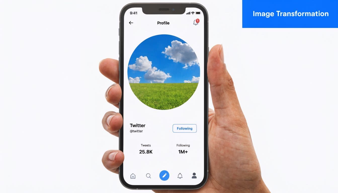
X still asks for a square upload, but it presents that image as a circle in standard profile use. The corners are effectively dead space. If your logo depends on edge placement, or your headshot is framed too tightly, the final result looks cropped even when the file itself is correct.
Design for the crop, not the canvas
The safest approach is simple. Center the subject and leave margin around it.
That margin is what protects recognition after X crops and shrinks the image. A logo needs enough padding to keep the full mark visible. A portrait needs space above the hairline and below the chin so the face does not feel squeezed. Initials and symbol marks usually need to be scaled down a little more than brand teams expect, because what looks balanced on a square artboard often feels cramped once the circle is applied.
I see this mistake constantly with founder brands and small teams. They approve the square file in Canva or Figma, then wonder why the live avatar looks tighter and weaker on X.
Small display sizes change what people actually see
Your profile image has to work in several contexts, and many of them are tiny. On the full profile, viewers get a clearer look. In the feed, search, notifications, and reply threads, the avatar becomes a fast recognition cue.
That changes the design job completely.
Fine lines start to disappear. Low-contrast colors blend together. Small text turns into blur. If the image only looks good when someone clicks through to the profile, it is not doing enough branding work in the places where discovery happens. For practical day-to-day account setup, these Twitter profile and posting tips help tighten the rest of your presentation too.
If the avatar is not instantly recognizable at feed size, simplify it.
What holds up best after cropping and scaling
The strongest profile images usually share the same traits:
- One clear focal point
- Strong contrast against light and dark backgrounds
- Enough empty space around the subject
- Little to no text
- A shape or face that stays recognizable when reduced
Branding and engagement intersect. A clean avatar gets identified faster in crowded feeds. Faster recognition builds trust, and trust improves the odds that someone clicks, follows, or remembers the account later.
Manual resizing makes this harder than it should be. Teams export one version, test it on desktop, miss how it looks on mobile, then repeat the process. PostOnce cuts that loop down by handling the formatting and publishing workflow in one place, so you spend less time checking crops and more time shipping content that looks right everywhere.
Common Profile Picture Mistakes and How to Fix Them
Most profile image problems aren't design disasters. They're small mistakes that become very visible once X crops and scales the file.

According to Adobe Express on Twitter sizing, guides often stop at specs and miss the performance side, even though optimized profiles can increase follow rates by 15-20%. The same source also flags a common automation issue: format mismatch from assets like Instagram's 320x320, which can create cropping problems and hurt mobile presentation.
If you want better day-to-day execution on X, these Twitter profile and posting tips help tighten the basics beyond just image dimensions.
Mistake one: the blurry profile photo
Symptom: the avatar looks soft, muddy, or slightly out of focus.
Diagnosis: the source file was too small, badly compressed, or exported in a way that damaged detail before upload.
Fix: go back to the original design file and export a clean web-ready version. Don't screenshot your logo from another profile. Don't download a tiny copy from your website and stretch it.
This is common with founders who pull a profile shot from an old team page or creators who reuse a thumbnail-sized logo from another platform. The file exists, but the source quality is already compromised.
Mistake two: the chopped logo
Symptom: the logo looks off-center or parts of it disappear.
Diagnosis: the design ignored the circular crop and used too much of the square canvas.
Fix: reduce the scale of the logo inside the square and recenter it. Most logos need more margin than expected. Wide wordmarks are especially vulnerable and often need a simplified icon version for avatar use.
A profile picture is not the place to force your full brand lockup if it can't breathe at small sizes.
Mistake three: unreadable text
Symptom: the image technically looks fine, but nobody can tell what it says.
Diagnosis: too much text, thin lettering, or low contrast.
Fix: remove text if possible. If the brand depends on initials or a short monogram, enlarge only those characters and drop any secondary wording.
That lesson is easier to see in action:
Mistake four: cross-platform reuse without adjustment
Some teams export once and reuse the same avatar across Instagram, X, LinkedIn, and Threads. That's efficient until one platform crops the image differently or displays it at a harsher small size.
The cure is simple:
- Create one master file: keep the original high-quality source editable.
- Prepare platform-specific versions: don't assume one export fits everything.
- Check on mobile first: small-screen failures show up fast.
- Favor icon over detail: if you're choosing between complete and recognizable, choose recognizable.
The accounts that look polished usually aren't doing anything fancy. They're just respecting how the avatar is seen.
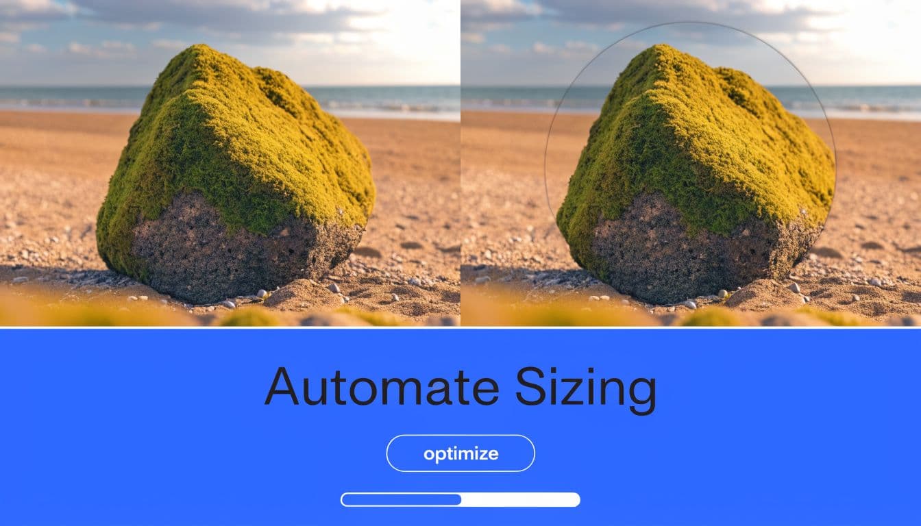
Optimizing and Exporting Your Perfect Profile Picture
Export is where a solid avatar either holds up or falls apart.
A good design can still look soft, cramped, or slightly off-brand if the file settings are wrong. X will compress, crop, and scale whatever you upload. The job is to give it a file that survives those steps with as little damage as possible.
For logos, icons, and flat brand marks, start with PNG. It usually preserves cleaner edges and avoids the fuzzy outlines that show up fast on small avatars. For portraits, JPG is often the better call because it keeps file sizes lighter while handling photographic detail well.
If your current headshot looks dated or inconsistent with the rest of your brand, a polished ai headshot generator can help you produce a stronger source image before exporting for X.
Best export settings by tool
The tool matters less than the output, but each one has its own traps.
Canva
- Set the canvas to 400 x 400 pixels
- Use PNG for logos
- Use JPG for photos
- Check spacing around the subject before download
Canva makes centering easy. It also makes it easy to fill too much of the frame. In practice, the best exports usually leave more empty space than the editor preview suggests.
Figma
- Build on a square frame
- Preview at small size before export
- Export in sRGB
- Keep the file web-ready, not oversized
Figma is useful because you can test recognition fast. Duplicate the frame, scale it down, and check whether the face, initials, or icon still reads in a tiny circle.
Photoshop
- Work from the original asset
- Use Export for Web
- Choose PNG for graphic assets
- Choose JPG for headshots
- Keep the final file under the platform limit
Photoshop gives tighter control over compression and sharpness. That matters when you're balancing clean detail against a file size X won't punish.
PNG, JPG, and WEBP trade-offs
File format affects more than upload speed. It changes how your avatar feels at a glance.
| Format | Best for | Trade-off |
|---|---|---|
| PNG | Logos, icons, transparent graphics | Larger files in some cases |
| JPG | Photos and portraits | Can soften edges on graphic marks |
| WEBP | Smaller files with strong visual quality | Less familiar in some team workflows |
WEBP can be a smart option if your workflow supports it, especially for teams trying to keep assets light without obvious quality loss. The catch is operational, not visual. Some design teams still default to PNG or JPG out of habit, which creates inconsistency across accounts.
A sharp export beats post-upload fixing every time.
If you want a faster way to prep the file before publishing, use this Twitter image resizer for X profile assets. It removes the manual guesswork and gets you to a square export that is ready to check and upload.
A practical export checklist
Run this before you publish:
- Check the safe area. Keep faces, initials, and logo details away from the outer edge.
- Preview at tiny size. If recognition drops, simplify the image before export.
- Pick the format on purpose. PNG for hard-edged graphics. JPG for portraits in most cases.
- Compress carefully. Smaller is good until the image starts looking soft or blotchy.
- Verify on mobile and desktop. Brand damage usually shows up first on the smaller screen.
This step matters because profile images do branding work every day. A clean export signals polish. A messy one makes the account look neglected, even when the content is strong.
How PostOnce Automates Your Image Sizing Perfectly
Manual social publishing breaks down when the same content has to look right on multiple platforms. The profile image issue is one piece of a wider workflow problem. Teams create once, then lose time adapting files, captions, and formats network by network.
That's where automation becomes the practical fix. If you're publishing to X alongside other channels, a dedicated Twitter crossposting workflow removes a lot of repetitive production work.
What automated image handling solves
The core value of automation isn't convenience for its own sake. It's consistency.
When you centralize publishing, you reduce the chances of:
- Uploading the wrong version to the wrong platform
- Reusing mismatched dimensions from another network
- Forgetting a crop check before publishing
- Letting brand assets drift between channels
That matters more as account volume grows. A solo creator might notice a bad crop and fix it quickly. An agency managing multiple brands won't always catch every platform-specific issue by hand.
Where teams save the most time
The biggest gain comes from removing repeated decisions. You don't want a team member asking the same questions every week:
- Which file should we use?
- Is this export too small?
- Does this logo version fit a circular avatar?
- Will the Instagram asset still look right on X?
A good automation system answers those questions through workflow, not memory.
For teams thinking more broadly about scalable asset creation, Best practices for social media image automation is a useful read because it frames image generation and resizing as an operational process, not just a design task.
The strategic advantage
Accounts grow faster when the brand looks consistent. Not flashy. Consistent. That means your profile image, post visuals, and publishing cadence all support each other instead of creating friction.
The hidden cost of manual handling is attention. Every minute spent fixing crops and exports is time not spent on positioning, hooks, offers, or creative. That's why smart teams standardize visual production and distribution as much as possible.
Automation won't make a weak avatar good. You still need a strong source image and sound composition. But once those are in place, automated formatting is the fastest way to keep quality from slipping when you publish at scale.
Your Blueprint for a Flawless Twitter Profile
A strong twitter profile image size strategy comes down to three moves.
First, use the correct upload spec. Start with a 400 x 400 pixel square and keep the file clean, sharp, and within platform limits. Second, design for how X displays the image. The circular crop and tiny feed display matter more than how the file looks in your editor. Third, stop treating profile setup as isolated manual work when your brand lives across multiple channels.
The same discipline that improves your avatar also improves the rest of your presence. If you're thinking beyond visuals and want a stronger publishing strategy overall, this AI playbook for X virality is a useful companion read.
Get the specs right. Keep the focal point centered. Build a workflow that doesn't rely on luck.
PostOnce helps you create once and publish everywhere without the usual resizing, formatting, and cross-posting mess. If you want your X profile and the rest of your social presence to stay consistent without manual rework, start with PostOnce.